Are you busy thinking about how to create infographics so interesting that those who discover them can’t stop looking at them again and again? And do you want to achieve this goal in as little time as possible? Don’t despair! This goal isn’t too grand!
In this post, we have gathered unique recommendations from the hands of the most incredible infographic artists of the world. Let’s get started.
Infographics: The noble art of graphing information

The first recommendation that you should never forget (as said by the most important infographic artists of the world):
Before all else, an infographic is a tool.
Of course. This seems logical. Nevertheless, this truth is quite often forgotten.
An infographic serves the purpose of synthesizing information. Its main task is the visual synthesis of data. Why is this done? To help the brain of your reader improve their comprehension of some data or facts. It turns out that “the visualization of information occurs in the brain of the reader” (we’ll see something about this in point 4).
A lot of infographics exist that not only help the reader but also confuse them even more. Simply type the word “best infographics” in Google search (we advise doing this exercise) in order to see hundreds of examples of this type of infographics. What happens with all of them? They don’t function as tool.
We’ll show you an example with a Red Pepper infographic about “The history of Social Media”.

No doubt it’s attractive. Beautiful typeface, good selection of colors, an innovative data arrangement at any rate, but the question is: does it carry out the function of visualizing information in a clear and intelligible way in order to help the reader quickly understand the different milestones in the history of Social Media?
Unfortunately, no. What is seen at a glance is a chaos of letters and numbers not easily recognizable. It doesn’t serve the purpose of a tool, but more like an esthetic object.
- Don’t focus too much on the aesthetic aspect of your infographic.
The priority is to communicate, to inform. Aesthetics come last.
Almost all the best infografic artists of the world agree on this, however there is an exception to this rule: when the infographic is designed as an artistic piece.
But if we want to make an infographic, aesthetics don’t weigh up to function. The focus has to be placed on the structure of the presentation, the integrity of the data (they should be related to one another) and the communicative efficiency. What if it can be as attractive and fun as well? Of course!
But without a doubt, what’s fundamental is taking the necessary time to:
- Select the Information
- Organize it
- Rank it
- Establish connections
And then look for a way to present this information, graphically.
Before choosing the graphic resources or forms that you are going to use to present the data, you should ask yourself what the purpose of your infographic is, what its features will be, what it is that you want your readers or users to get from this graphic.
Alberto Cairo describes it like: “Function doesn’t determine form, but it does restrict the types of visual forms which the data can adopt”.
Basically, when you take on the task of making an infographic you have to give your readers answers on the theme in question. For this, you will have to think about what questions could reach these users.
Are they going to want to relate data? Are they going to want to share and classify? Will it only be limited to a general overview of the topic? Ok, we know what you are thinking. That you’re not a clairvoyant and that you can’t know exactly what your reader wants to learn. But it turns out that you surely work for a certain brand and already mildly know your readers. So you can guess what they are going to want to obtain from your infographic.
This process will help you to decide what types of graphic resources you are going to include in your project. It could be that you need to use various ways of representing data to answer the different questions of your readers. Never limit your creativity!
If you want to make a good infographic, you have to be capable of eliminating the unnecessary so that the necessary stands out. A good example of this is newspaper infographics. They are based on the famous 5 questions: What?, Who?, When?, Where?, how?
Here I’ll show you an example of an infographic of the Whale.

- Don’t stick with simple information presentation,
Also think about turning your infographic
into an exploration tool for the reader.
How are you going to achieve this? There are various secrets that we can classify based on the type of infographic.
-
Statistical Infographic
It has to do with numbers. If the theme permits, statistical data are always excellent graphic resources.
In the article “Graphical Perception: Theory, Experimentation, and Application to the Development of Graphical Methods”, two investigators, William S. Cleveland and Robert McGuill, present what they call as elementary perceptual tasks: ten methods to encode visual data. They are classified from best to worst. The firsts on the list are those which the brain interprets and understands best.

According to this scale, bar graphs (the first three on the list) are the best if you want your reader to make more precise comparisons without needing to make the brain work a lot. The brain has difficulty comparing curves, angles and directions.
Without a doubt, bar graphs allow better comparison. As for bubble graphs, the difference is almost not perceived. The last three elements of the list (curvature, tone/ color intensity, color saturation) can be used to give a more general overview, enhance behavioral patterns or display tendencies.
- Kid´s Zone. Online graphic generator. It allows you to choose, for example, between this graphics:

- Chart Chooser. Free statistical graphic templates on Excel and Power Point
This is not the only way to display statistical data. Observe this awesome infographic by Jaime Serra.

-
“Timeline” Infographics.
It’s very easy to notice that this information is displayed progressively over a determined period of time. Remember the infographic we saw on the History of Social Media? It was the perfect opportunity to use a timeline. Look at this timeline from the website Adweek, it’s much clearer, don’t you think?

-
Process Infographics.
It is the type of infographics that you have to use when your objective is to show a process or the operation of an object. The clearest example we have is very close: visualize the creation process of an infographic.

-
Informative Infographics.
Obviously, all infographics are informative. So, the ones that receive this name are those which are limited in presenting information with a larger amount of text (not in every case) and using the graphic poster format. We have an example here of a CreativeMarket’s informative infographic.

-
Geographical Infographics.
As its name indicates, they are infographics which use maps in order to visualize information. Here we have some tools for creating or downloading geographical maps.
- Umapper.
- Xpeditions Atlas (National Geographic). It is a generator of maps of the entire world in GIF or PDF format. I recommend trying its tool for creating interactive maps.
- Worldmapper. Is a collection of maps by category. Meaning, with presentation of figures and percentages based on population, health, poverty, violence, resources, etc. All of which are in PDF poster format.
- Needless to say, Google Maps and Google Earth are the most valuable resources in terms of cartography.
-
Compare/Contrast Infographics.
Advantages and disadvantages, differences and similarities, what’s good and what’s bad, what you should do and what you shouldn’t, old/new, rich/poor, among many other opposing questions which are ideal to show in an infographic.

- Hierarchy Infographics.
The most famous is the image of a triangle with levels of importance. Surely you have seen the nutritional food pyramid. This is a hierarchy infographic.

- Interactive Infographics.
The give the reader more possibilities to interact. The user is going to be able to explore the data and add more depth to their knowledge about what interests them the most.

-
Cloud, word or tag Infographics.
This can also be associated with the well known term “brainstorming”. The gist is almost the same: letting flow the keywords related to your infographics’ theme, which have a relation to other words and allows you to play with the data. Wordle is a tool that lets you enter a text you’re interested in and carry out “Word clouds” for later use in an infographic.
Ready. Now that you know how to select the information of your infographic, what data it will include and how it will be presented, it’s time to put those hands to work. And for this I have created a list of websites where you can find free templates.
- Venngage: Allows you to create and publish infographics online. It’s easy to use and has numerous visual resources to apply. You must be a Premium user in order to download the best infographics of this site.
- Canva: We all know how wonderful Canva is for creating graphic elements with almost no expertise. However, the infographic templates available on Canva are not very attractive. They are rather basic graphs that only have a proportion of 800×2000 px.
- Infogram: Has a large variety of graphs, charts and tables. It’s ideal for executing statistical infographics. Infogram functions with an data editor similar to a very easy to use Excel spreadsheet. Without a doubt you have to try it if you are going to work with numbers.
- Piktochart: Is very similar to Venngage, with almost the same editing resources. The bad part about it is that the free version only offers you three basic themes.
- Easely: this website doesn’t offer you infographic templates, but can be very useful to you for creating your own designs. It has numerous resources such as shapes, arrows and lines. It’s very simple and easy to use.
- Visualize: This is especially created for the designs of infographics. Not only does it have great templates, but also charts, timelines, bubble graphs, among other elements for creating complete and personalized infographics for you to download as PDF or PNG.
- We highlight Genialy for being an incredible backing for executing interactive and animated infographics.
These are some possibilities that we have highlighted from the Web. But it should be clear that, even though you are not an expert, you still have the possibility of creating infographics with Power Point, Photoshop or Illustrator. No doubt that it’s a little more complex and you’ll have to designate a larger portion of your time. Don’t be afraid! We have the solution.
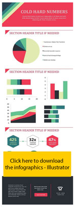
By clicking on the infographic on the right you’ll get from free “templates” for Power Point and by selecting on the right side, you’ll get Illustrator infographics. Were you thinking that you weren’t going to be able to make an infographic in a short amount of time?

- Don’t forget that the infographic (like any other communication tool)
It aims to enhance the readers’ understanding.
This is especially designed for them so that they can easily understand a fact or a concept, saving them time. In addition to being attractive, it must facilitate fluid and dynamic reading.
With all this advice running through your head, you’re completely ready to start creating your own infographic.
Next you can share your experience with us. We’re interested in knowing what tool you used, what type of infographic you selected based on the theme and anything thing else you’d like to tell us. We are here to help you.
And on a final note, if you liked this blog post, share it with the contacts who you think it could help them! See you soon!