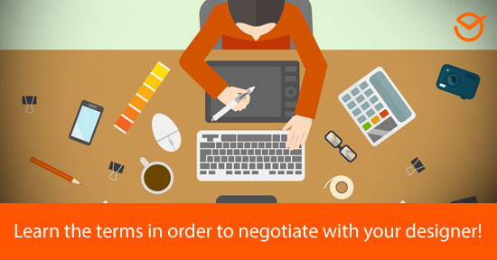
These days, in which “everything is taken in through the eyes”, seems to be truer than ever; especially in the Digital Marketing field. Social Networks and websites give an increasing importance to visual elements, and this is why today I’ll share with you 15 graphic design terms that every marketer should know.
The selection of terms that you will find in this article is to provide you the basic elements so that you can negotiate with your designer and help them understand what you need as accurately as possible. Don’t forget to share this post with your work team!
Why should you know basic Graphic Design terminology for Digital Marketing?
As we said earlier, these days everything is taken in through the eyes. This especially applies on the Internet where the effectiveness of Marketing strategies greatly depend on the use of effective graphic designs, professional images, clear typefaces and a unique and attractive style.
Graphic design is particularly important during the “Branding” development of your proposal. Branding, as defined by specialists, is the process that involves creating a unique name and image to represent a product in the minds of consumers.
Thus, both to develop your brand image as well as create visual content for Social Media, graphic design is fundamental. Now, that being said, shall we go on to the main theme of this post?!
15 fundamental Graphic Design Terms for your Digital Marketing Campaigns
1- Sketch
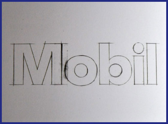
A sketch is a drawing or graphic representation of an idea which aims to illustrate the basic outlines of a visual piece (for example a logo). It functions as a draft, with the intent of implementing all the necessary modifications until coming up with a model closest to the desired work, to guide its further development.
When do you use it? When you ask your graphic designer to generate a logo, flyer or other visual piece for your business (which can be large or small, with certain colors and specific characteristics of your preference), it’s advisable to request a sketch in order to agree on how the requested elements will be implemented.
2- Logotype /Logo
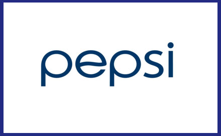
The term logotype refers to the graphic representation of a brand made up entirely of words or typeface. So those institutional or corporate symbols that include drawings or icons are not strictly logos (like we’ll see later).
When do you use it? When you need to generate a visual and textual identity of your brand. Thus, logos are especially useful for transmitting you proposal’s concept through text, and the spirit of your brand through visual elements such as typeface, color, size, etc.
3- Isotype
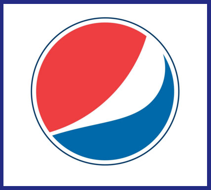
An Isotype is the visual representation of a brand or text which lacks textual elements. In this sense, it’s the opposite of a logotype. It represents the identity of a business or commercial proposal simply through an icon or drawing so that users identify the brand by only seeing it.
When do you use it? When you want to simplify your brand’s representation, for example, by including it on your business cards, on your Social Network profiles, in the design of your Email Marketing campaigns or in your Social Media images (via a watermark).
4- Isologotype
The Isologotype is a combination of an Isologo and a Logo, so basically it’s a visual representation of a brand made up of icon and text. Its main characteristic is that both (icon and text) cannot be separated since they function as a whole and must be represented together.
When do you use it? When you want to compress your brand’s identity into a single visual piece. The advantage of the isologotype lies within its wealth of information since it has the clarity of text and the expressiveness of iconic visual elements which complement and illustrate the concept.
5- Corporate Design
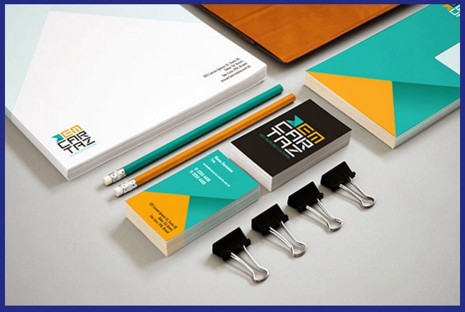
In terms of graphic design, Corporate Design refers to the interrelation of all the graphic pieces created for a brand based on common guidelines. Also, it maintains a visibly identifiable identity in order to represent a commercial proposal both within the company (towards employees) as well as the general public (consumers).
When do you use it? When you need to create and project a company identity within and outside of your company. For example, you can define some “corporate colors” and a “corporate typeface” in order to identify your brand, from your office materials to your email headers for Email Marketing.
6- Image resolution
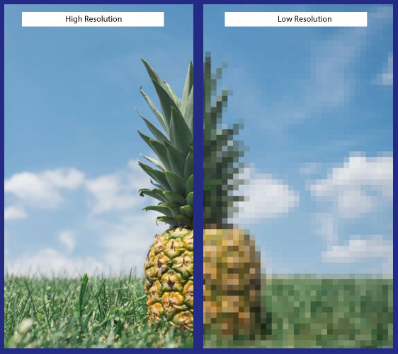
This graphic design term refers to the degree of detail that a particular image has. The higher the resolution, the better the image looks in terms of sharpness and visual information. So, to support a good resolution on your site and Social Networks it’s advisable to consult the recommended sizes for Social Media.
When do you use it?: You can request from your designer that they use high resolution images to guarantee the best presentation on your site, social networks and other broadcasting spaces of your brand or products.
7- JPG or PNG Image
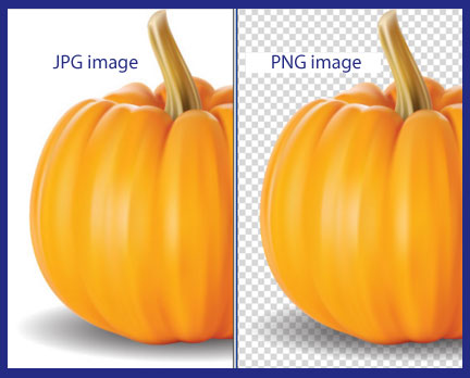
Both are image formats with each one of them being useful for different purposes. JPG format contains million of colors and is perfect for sharing large size photos on Social Networks. Meanwhile, PNG is the ideal format for supporting better quality photos, regardless of the device on which they are displayed.
When do you use it? When you want to preserve the quality of your photos regardless of the type of device they are displayed on, and if you need to use images with transparent backgrounds, PNG is the indicated format. Whereas for sharing large images with greater ease and not losing significant quality, JPG is suitable.
8- Palette
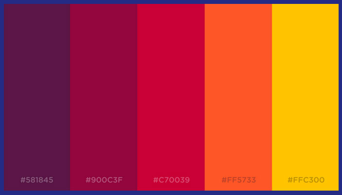
Known in graphic design as “Palette”, it is a selection of chosen colors in order to compose a particular design. It can also refer to a more general characterization, for example “a palette of warm tones” means that the tones transmit warmth (so colors like red, yellow or orange). The opposite would be a palette of cool tones (blue, light blue).
When do you use it? When you want to tell your graphic designer to use a specific selection of colors, which they’re already familiar with, to compose a new visual piece.
9- Transparency/Opacity
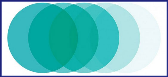
Transparency is the grade of opacity an image has. It specifically refers to how translucent a photo or visual piece is in particular. So an image with a high degree of transparency lets you see what there is behind it, whereas a greater degree of opacity, more “density” features the photo.
When do you use it? When adding a watermark to personalize your images on Social Networks you can control said brand’s transparency degree in a way that it is visible without covering or blocking the image behind it. Likewise, it’s useful in collages and as an esthetic resource for graphic designs in general.
10- Typography with Serif/ without Serif
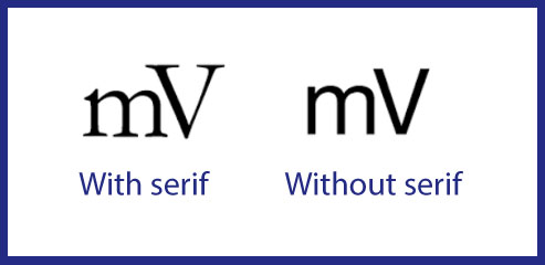
Typography with serif are types of letters that present embellishments located at the end of a character stroke. They are characterized by giving a more formal appearance to the text. Meanwhile, typography sans serifs lacks these embellishments and stand out by being more legible.
When do you use it? When you want your texts to have a more modern and clean aspect you can use typography sans serif. If instead you want to transmit a more classic and traditional identity, typography with serif are a better alternative.
11- Monochromatic Design
This term refers to those designs whose color scheme is based on the same tone and its variants. So for example, a monochromatic graphic piece can be created based only on the color red. This technique is especially useful to save on ink, in case you wanted to print your design on paper.
When do you use it? Like we said, its recommendable if the goal is to save ink while printing your design. It’s also a good option if you want to come up with a graphic piece in little time without being concerned with matters such as color schemes.
12- Pantone
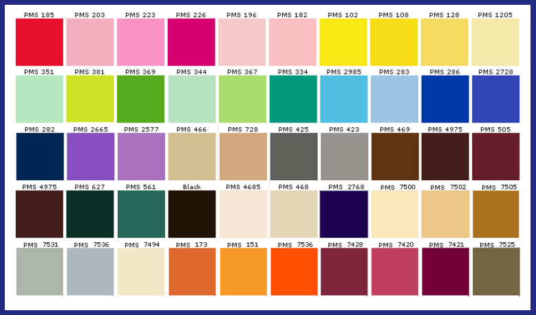
The “Pantone Matching System” is a standardized color system, created especially for identifying each tone with exact precision. Thus, every color included in this classification is numbered with the goal of simplifying the process of using an exact color tone in designs and prints.
When do you use it? When you want to tell your graphic designer to use a color in particular, without risking any misunderstandings due to differences in shade that different screens and devices might exhibit, you can use the Pantone system.
13- Saturation
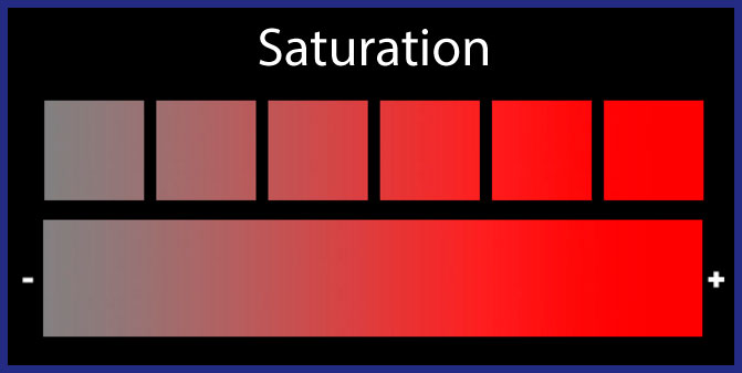
Saturation is the quantity of color present in an image. So the more saturation in an image, the stronger the tones will be seen that make up the image. A lot of times, a saturation that is too high can impair the display of the image; meanwhile a slightly pronounced degree provides better dynamism to the composition.
When do you use it? You can increase the saturation of your graphic design’s or images’ colors if you want to emphasize a greater sense of joy and dynamism. On the other hand, if you want to convey sobriety it’s advisable to maintain a neutral saturation.
14- Contrast
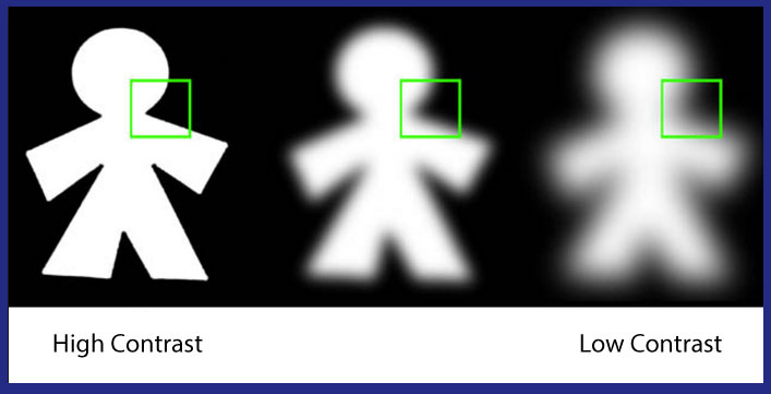
An image’s contrast is the difference in the intensity of the colors that make up the image. Take for example a black and white photo; the contrast is marked by the difference in illumination intensity within the range of black and white.
When do you use it? To give a more compelling appearance to you images you can in the contrast of tones. If instead you want to maintain a more uniform look throughout the composition, I’d advise you to reduce the contrast.
15- Image banks
And last, Image Banks are photograph reservoirs that you can go to in order to easily find the pictures you need. So for example, if you need am image of children playing to promote your business on Children’s Day, you can go to an Image Bank instead of having to take the picture yourself (more convenient if you have little time).
When do you use it? When you need to get specific photographs for your Email Marketing campaigns and Social Networks. Take a look at our article on the best free image banks to find the most convenient options for your designs.
This is all for today! I hope that this list of basic Graphic Design terms for marketers will be useful to you when creating your campaigns and graphic pieces.
Did you like this blog post? Would you add any other term to the list? Tell us your opinion! And please, remember to share this article with your contacts. See you soon! 😉