
Email newsletter template design is an essential element to consider when you do Email Marketing. You may work so hard on your content but if your newsletter template design isn’t good, your contacts will surely move on to their next email.
Your newsletter template design is as important as your content, an eye-catching and carefully drafted newsletter template can be very effective to retain and bring in additional customers.
Newsletter Template Design Structure
Let’s start with the structure of your newsletter template. There are 5 golden rules to remember:
1- Pre-header
A pre-header can be found on top of an email right after the subject line. How many times have you read “View this email in the web browser”? A lot actually, isn’t it?
The functionality of the pre-header is when a newsletter is not well displayed in an inbox, it will direct contacts to a web browser so they can see the content and images of the newsletter.
If you want to make the most of a pre-header, don’t hesitate to personalize it by giving additional information on your product or service or a new offer you’re about to propose. Beware, don’t copy your subject line sentence to your pre-header, but create a sentence that is a complement to your subject line.
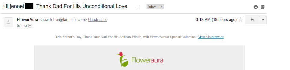
Floweraura used Father’s day occasion to send a newsletter to their contacts and they didn’t miss a chance to personalize their pre-header too:
2- Template
Creating and sending newsletters to thousands of people was a headache before as marketers and developers spent time on coding or creating newsletters on Photoshop. But, ever since Email Marketing tools have appeared on the market, sending a newsletter has never been easier and quicker.
Choose carefully a good email marketing tool that is easy to use and that has all the features to facilitate your task of creating and sending newsletters. Mailify has almost 900 responsive newsletter templates from where you can choose the one that fits your need.
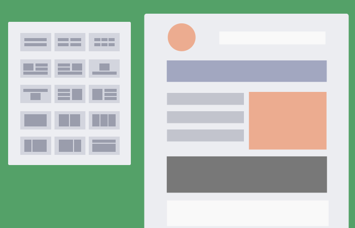
You don’t have to worry about the layout of your newsletter template anymore. With the EmailBuilder, all you need to do is to drag and drop blocks and arrange it as you see fit. Once you have a template to work on, you can add your pictures and content and there you go the template is almost ready! Don’t you think your layout is great? You have hundreds of pre-built responsive templates, pick one template that fits your industry and service and personalizes it with your company logo, color, content, and images.
3- CTA button
A call-to-action button, commonly referred to as CTA button, is a powerful tool to convert visitors to buyers. You won’t miss a CTA button if you see a big colorful button on a light background, there it is, a big attention seeking button trying to attract the attention of your readers and direct them to the product or service.
The placement, attractiveness, and frequency of your CTA button are very important to increase your contact’s engagement.
Be strategic on where you place your CTA buttons in your newsletter template. The top of your newsletter is the best place to have your CTA buttons, this way your readers can’t miss them and an additional CTA button at the bottom of your newsletter will be another way to remind them about the offer.
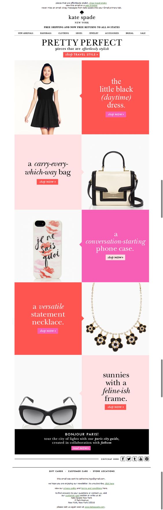
Kate Spade added more than 2 CTA buttons, all of them are in contrasting color than the background and directs to various pages of the website:
4- Images and videos
Almost 70% of e-commerce website shoppers have stated that image plays an important role in their purchase decision. Treat your contacts with good visuals because pictures engage your audience and communicate the message you wanted to convey.
Although images are a powerful tool to use in your campaign, you should balance your email between pictures and text.
The right measurement is 40% images and 60% text.
In this newsletter, Mailify has created a template balancing the 60% text and 40% ratio.
Videos have also a big impact on your audience because it attracts the attention of your contacts with a flow of images and sounds. The best and easy way to include a video in your email is to add a thumbnail of the video and a link that directs to the video.
52% of marketers have said that adding videos in their campaigns have increased their conversion rates (Syndacast).
5- Footer
A footer is usually used to share basic information such as links to social networks, legal terms, an opt-out link and the reason why your contacts receive your email. This will help you forge an identity as an honest and credible sender.
Also, you can use your footer as your signed form with your picture, your contact details or create a personalized footer with a design element or background element, or even add lists of recent articles from your blog.
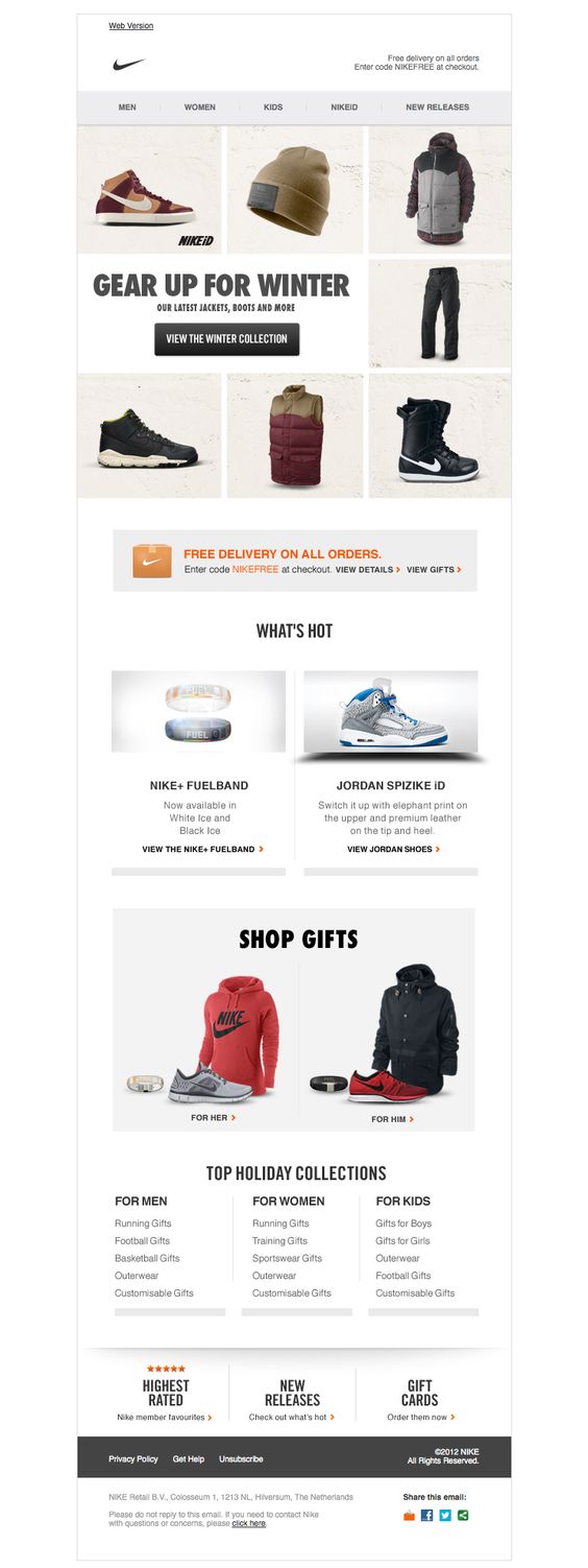
Check this Nike’s newsletter footer, they have put all basic elements like an opt-out link, get help, address, social links etc.
Content Layout
Create a content that is precise and short. Readers should be at ease when they read your email. A cramped content with small fonts can easily demotivate your readers. Here are few guidelines to work on your content’s format:
Divide your content into subheadings
Break your content into subheadings to create a newspaper look.
Guide the reader’s eye to quickly scan the content and understand the context of your email. By dividing your content and giving space between texts, your newsletter will have a great layout and a logical flow of information. Choose the subheadings font size carefully, it is normally smaller than a header font size and bigger than the text font size.
Give space
Create negative space to direct your reader’s eye to an image or CTA button.
For example, you can add a text on the left side of your newsletter template and include an image or a link to your website in the right column. You can give space in between your text lines, and if you picked a smaller font, make sure you give space in between texts.
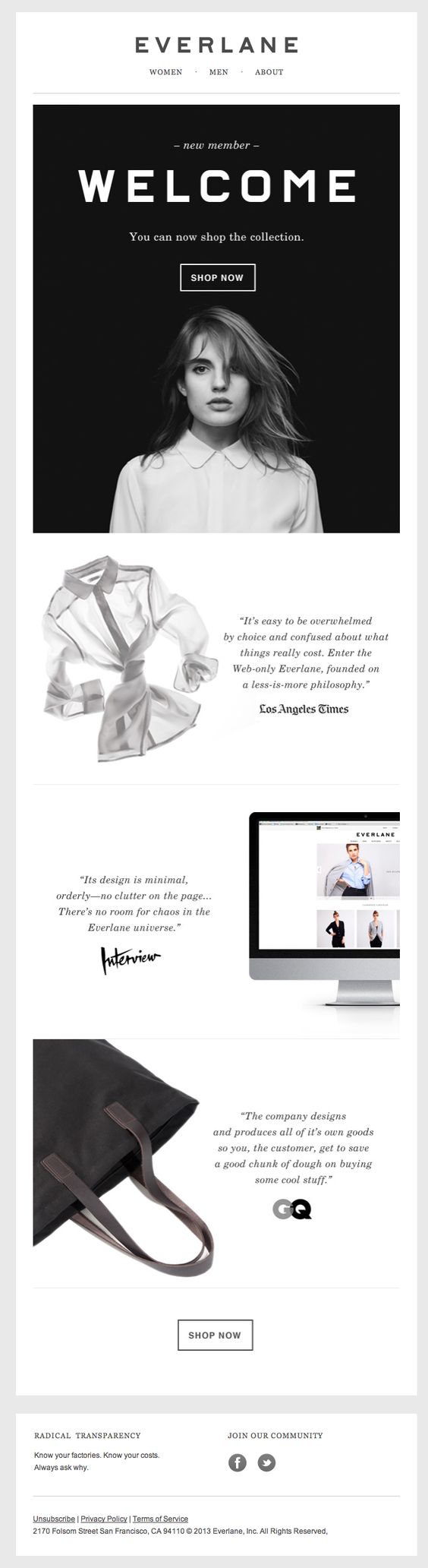
Everlane has a minimalistic design and created a lot of negative spaces in their newsletter:
Pick the right font
There are various fonts that you can use on your email. Carefully choose the font that will not only look good but it will be easy to read. You can change fonts in your content but have a right balance of fonts. If you want to play it safe, you can use the most common fonts used in emails like Arial or Times New Roman.
Add links
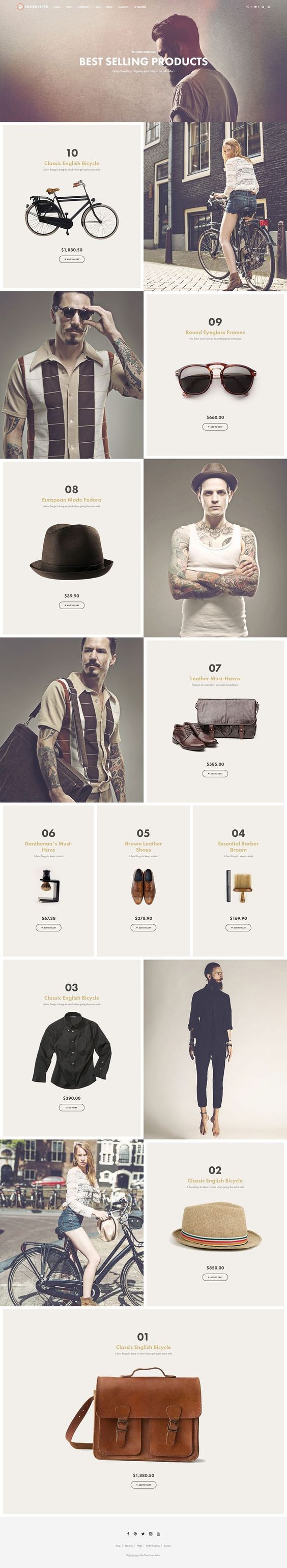
You want to show your contacts your products but you notice you have a lot. Don’t hesitate to stack your content like this template from Jeremy Carrara, gather your products in various categories and add a link and image to the page where your contacts can access to the product’s information.
Unify Your Newsletter Template Design With Your Brand Image
Your contacts have access to your company’s 3 main channels like your official website, your newsletters and your social media platforms. If your company’s brand design, font, and color have variations on these channels, you customers will not be able to recognize you immediately.
It is essential to create a look that is consistent on your various channels of communication.
To do so, follow these tips to unify your branding in your website as well as your newsletter template:
Logo
Your logo is your mark of identity and speaks a lot about your company. It can help your contacts to recognize your company.
Include your logo in your newsletter template and place it on top of your email.
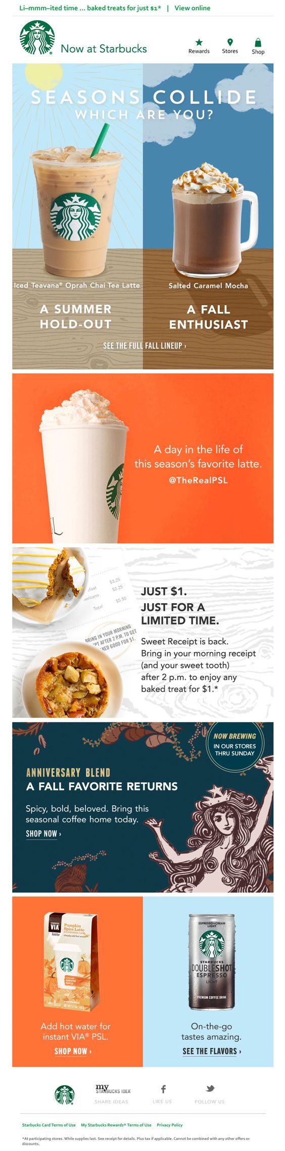
Find the example from Starbucks newsletter below. Your readers will immediately identify you and know under what context you’re sending emails to them.
Be consistent on the color
The color of your newsletter template design is as important as the color of your website. The same goes for your logo. There should be a consistency in the choice of your color palette, so your contacts can recognize your company.
Pick one or two tonnes of colors that you have used on your website and replicate them in your newsletter template design.
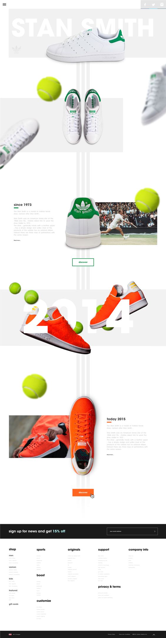
Adidas has the same white tone theme on their website and has replicated the same look for their newsletter.
Display pictures that are easily detectable
Using the same images as your websites’ creates consistency between your brand and your newsletter template design. But don’t overload your newsletter template with too many images. Many email clients won’t display all your images and more importantly, anti-spam filters can move your email to the spam box.
Your campaign will be much more effective if you follow these simple tips. Don’t forget to:
- Personalize your pre-header and complement it with your subject line
- Assemble your template with the help of an email editor or choose a pre-built template and make it yours!
- Place your CTA buttons on top and at the bottom of your email and color it bright so readers won’t miss it
- Add images, videos and GIFs to animate your newsletter template. A brain process images 60,000 better than text
- Give more details about yourself or your company’s like your contact details, reason your contacts are receiving your email, an opt-out link etc and create a background design
- Divide your content into subheadings to help your recipients to quickly scan the text
- Make lots of place between images and text blocks to direct your contact’s eye to important elements like a CTA button or a link
- Select the right font for your content that is easy to read and professional
- Stack your content, create 3 or 4 categories and add a link to the page where your contacts can have more information
- Include your logo in every newsletter so your contacts recognize you immediately
- Be consistent with the color of your newsletter and your website
- Display pictures that are used on your website to be consistent on all your platforms and create a uniform look