In the previous article (Part 1), I had promised that I would show you that it IS possible to create the perfect blog post and that there’s even a scientific way that allows us to do it.

In “PART 2”, I’ll keep revealing secrets and sharing scientific data, of design and psychology, so you can be sure to include all the necessary details when you create your next perfect blog post.
The topics we’ll develop in “Part 2” of “How to create the perfect blog post”:
(PART 1 contains: the introduction, scientific reasons, as well as, points 1 and 2)
3- How to create the perfect intro paragraph to captivate your reader: characteristics, the science of curiosity, formulas, and ideas to implement now.
4- Writing so that even antsy people stop to read your content: the inverted pyramid of journalism.
5- The power of storytelling: the title draws the attention, but the story is what backs it up. Tricks and features that’ll make readers devour your post from start to finish. Plus … 6 principles of persuasive communication you can use to influence undecided users.
6- Design Tricks for making your text scannable: number of words per line, text width, white space, font size, line spacing, and other amazing facts.
7- Images: why use them and some legal aspects that you should keep in mind. A review of the fundamentals of color science and its power to persuade.
8- Virality: tools for getting your content to be shared over and over again.
9- A check list that you should use to make sure you don’t forget anything. 🙂
3- How to write an attention-grabbing intro paragraph
3.1 Components that you shouldn’t forget to include in the intro paragraph:
a- A trigger that grabs the reader’s attention.
b- Introduce the purpose of the post: indicate the problem it will solve
c- Explain how you’re going to solve that problem
3.2 How to make a super compelling intro paragraph to get people to start reading your article immediately
Remember, the title grabbed their attention, now you’ve got to hold on to it.
I- CURIOSITY: the secret that the smartest writers use to persuade.
How does curious work?
Curiosity is an innate behavior in all humans, and follows a curve with the shape of an inverted “U”: We become more curious when we know a little bit about something, but not everything.
Based on this research, George Loewenstein developed the Gap Theory, which indicates that curiosity is triggered when a person feels that there is a gap between what they know and what they want to know. This creates an emotional impact, and forces us to look for more information or continue to read something.
Derek Halpern shows us a formula for applying curiosity to the intro paragraph, here are some examples to take advantage of:
(1) New, Cool, and/or Hopefully Remarkable Thing + (2) Desirable Outcome = Curious Reader/Viewer
Examples:
- How’d you like to learn to use this (1) amazing app for (2) counting cards and then (2) make lots of money? (It’s a little immoral example, but still valid in the end …)
- Ever wondered how you can (2) attract more customers with the use of (1) excellent visual content?
- There’s a way to (1) create the perfect blog post and you’ll find out exactly how to do it (2) with this amazing, super detailed article (this is the one I’ve applied :))
- The key to better performance in physical training, is to make sure you complete these 4 amazingly super easy steps. (This time, discover the 1 and 2 for yourself)
II- CONFLICT: it’s another secret or technique for starting an intro paragraph with.
Although we’re going to develop the aspects of storytelling later on, we can’t help but mention it here too. “Good stories are about challenges and conflicts.” Without these elements, it’s hard for a story to become interesting. It’s necessary to show how someone resolves or deals with a conflict or challenge.
The key: start with a person and a conflict. Put together ingredients, such as descriptions of time, space, and emotions.
3.3 Ideas to start the first paragraph with:
In this excellent post by CoppyBlogger they cover the following ideas:
a- Ask a question: generate curiosity and make the reader stop and think.
b- Share an anecdote or quote: these can make people laugh or immediately establish a relationship with the main point of your post.
c- Invoke the mind’s eye: creating a mental image is very powerful because it captures the imagination of your reader.
d- Share something personal: it’s a storytelling technique and something that quickly generates empathy.
e- Use an analogy, metaphor, or similie: this provokes mental imagery and allows readers to tell a story to themselves.
f- Cite a shocking fact: people want facts. The fact should be directly related to the topic in question.
4- Writing so that even antsy people read your content.
As we said earlier, most people don’t “read” the whole article. Even patient people don’t have that much time, that’s why we need to apply a classic technique of journalistic writing: the inverted pyramid.
It consists of starting with the conclusion, with the results, or the end. Be clear and specific at first. Then provide the details and expand on the what, the when, the where, the how and the who, later on.
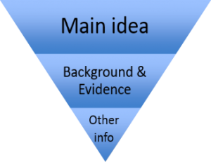
After each heading or title, the inverted pyramid should be applied so that our readers can quickly gather the most important information and easily scan through the text.
5- How to apply storytelling in your blog post
As we said earlier, a good headline draws attention, but a good story maintains and develops interest.
On the Postcron blog, we did an article that explains all about Storytelling in Social Media, and why its effect on people is so powerful.
Storytelling is the “art” of giving shape and meaning to a piece of information that’s dull and boring. It’s also one of the most powerful tools in advertising for persuasion, as it combines ideas with emotions.
In that article, we actually named the Bible as the largest and most powerful example of storytelling. It’s not only managed to hold up its story for centuries, but it also been able to persuade the masses. It would have been really hard to get the interest and stick the teachings and messages of Jesus in the minds of the faithful, with just a list of facts, dates, information, lessons.
5.1 What elements does the story need to have in order to be powerful?
1- Something personal: by this we mean something real. Including perfect pictures, perfect situations or perfect stories, doesn’t generate empathy, even less, it doesn’t generate identification. Storytelling is anything but “perfectness”. Storytelling is authenticity.
2- Introduce a conflict or challenge. As we said in the beginning, the best stories show how a person overcomes conflicts and challenges.
3- Include real emotions that move the reader: fear, desire, anger, happiness, anguish, etc..
4- Give descriptions that allow us to create a mental picture and be taken on a narrative journey.
On top of that … Persuasion:
Just as we’ve indicated, Storytelling is a powerful advertising tool to convey concepts and position a brand, but … do you know how you can improve your communication skills with persuasion? The 6 principles of persuasive communication allow us to apply the fundamentals of psychology to marketing.
1: Reciprocity
2: Consistency
3: Social Proof
4: Sympathy
5: Authority
6: Scarcity
If you want to know more about this topic, don’t miss our article on the 6 most powerful techniques in the science of persuasion.
6- Design tricks for making your text scannable, appealing and easy to read
Nielsen said: people don’t read the text, they scan it. So, want to know how to make your post apt for “human scanners”? Keep reading!
6.1- Ways to make your post more scannable:
A– Provide small “bites of information”: a high density of text doesn’t favor readability and even less for comprehending quickly. The concepts should be easy to identify. We recommend between 4-7 lines maximum per paragraph. For each paragraph, just one idea.
B- Unfold the information in different titles or headings. This helps readers identify the concepts and choose what to read or not.
C- Use focus points to guide the user through the article and direct their attention to the information you want them to read. Lists, indentations, quotes, phrases, and graphics. Words in bold also help a lot to emphasize main ideas.
6.2 Design concepts to make your text more readable and appealing:
In order to expand on the points above, we’ve got to have some understanding of design. This will help us optimize the structure of our content visually and make it more attractive. Eventually, encouraging the reader to read from beginning to end.
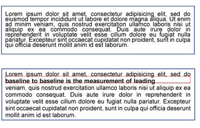
a- Leading: the spacing between lines. It depends on the type of font or typeface. There are some that are very robust or “drawn”, but the general rule is that the amount of spacing (leading) should be at least 2 points larger than the the font size. For example, if this is 10 point, the spacing should be 12 point.
Eg: bad spacing and good spacing
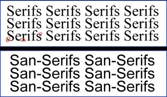
b-San-Serif or Serif: In the Serif fonts family contains, for example, Times New Roman. While in the San-Serif family, we have Arial. Serifs allows you to create a good solid base that separates better visually, one line from another. While the Sans-Serifs, may not provide this benefit, its simplicity makes it easier and more fluid for the eye to read.
c- Number of fonts: While using a variety of fonts can make content more dynamic, it may also negatively affect the “consistency” factor. There should be a clear consistency in the use of fonts, as readers begin to build partnerships between them and the content. If you use X font and size for subtitles, and Y for titles and Z for text development, don’t go mixing them up later on, because you’ll definitely confuse the reader. The general rule is to use 3 fonts or less.
d- Margins (width of text) are a way to manage white space, and force the reader to focus on the central part of the text. In addition, it may be a factor which makes moving from line to line easier on the eye.
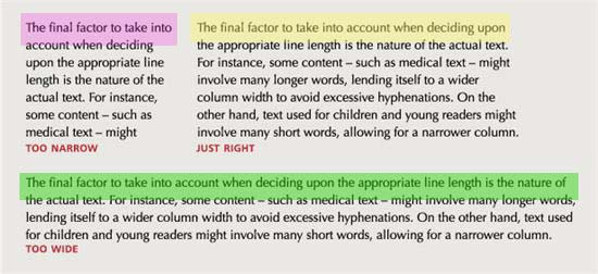
Of course, the width of the text depends on the nature of the content and the audience. Children are still exercising their eyes, so they need shorter lines and larger letters. However, in a scientific text, the words are often complex and long, so each line, tends to be more extensive.
Basically:
- Narrow text: they’re less work for the eye to move from one line to another, but in turn, they decrease the speed of reading, since the reader isn’t able to see enough information at once to start linking ideas.
When people read they skip small groups of about 5 to 10 characters at a time, and the average eye makes about 10-12 jumps per line. With this info, we can calculate that readers might consider only 70 characters of the line.
- Wider Text: if a line is too long, the reader’s eye will have difficulty focusing on the text and make it difficult for the eye to move from one line to another. However, it allows for faster reading.
To conclude: Derek Halpern indicates that narrow text is not very practical and a really long one doesn’t allow for fast reading comprehension. Therefore, somewhere around100 characters (500 – 600 pixels wide) is recommended to ensure speed and comprehension.
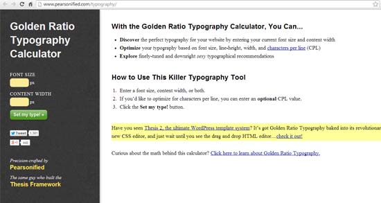
If you want to see how the width you’ve decided on for your post, will appear, there’s a page that lets you to see the final result, by entering a few pieces of info: font size, number of characters per line (CPL), or paragraph width, in pixels. Checks it out ? this tool.
7- Images
7.1-Why is it so important to use images?:
Because they:
- Provide visual support to the concept of the text and facilitate comprehension and transmission of the spirit the post.
- Add another element for gaining visibility in Google searches. Be sure to name the image file, containing the keyword, so that they show up in search engine results.
- Add appeal to the text
- Create an opportunity for your post to be “pinned” on Pinterest, expanding the reach of the article.
7.2 Avoid legal problems:
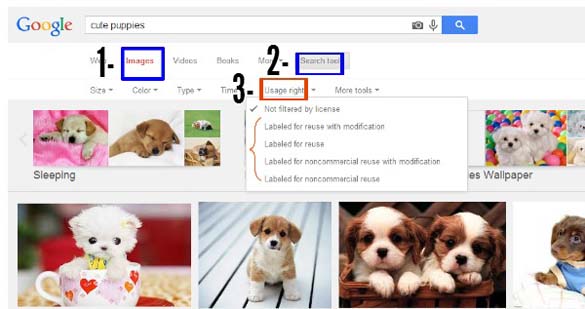
If you don’t want to pay for an image bank, it’s ok, you can use Google’s, but make sure you are using the right ones. You must select the ones, in which the rights of use, enable the use and modification them. To find out how to do this, follow these steps:
7.3- The science of color: mistakes you must avoid making
The science of color is extremely powerful, as color is the factor that matters the most in the process of conversion on a landing page, in addition to other design elements such as: Size, Shape, Location, and Movement. In this part, we’re going to make a short list of the mistakes you need to avoid making when utilizing color in your post, site, or landing page, and to help you provide a pleasant experience for your readers.
Common Mistakes:
a- Emphasis
b- Number
c- Combination
d- Message
e- Flow
Don’t miss this article: “18 Amazing Facts About The Science of Color That’ll Help Increase Conversions and Clicks”, because in this post, we develop each of these mistakes in detail and also include some amazing tricks to apply to call to action buttons.
8- How to get your perfect content to be shared throughout social networks:
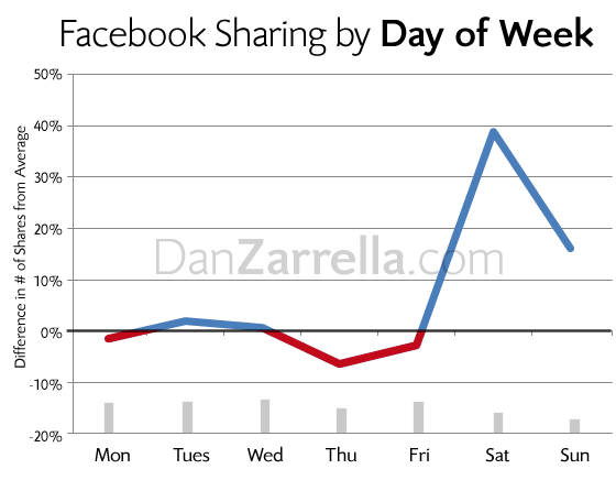
The social media “scientist”, Dan Zarella, did another study that concluded that:
a- Share your blog post on Saturdays. His study showed that the most stories are shared on the weekends, especially Saturdays.
Remember that to get your now perfect blog post to go viral, you’ve got to make a strong campaign to promote your new content. As we said before, there’s no point in creating new and awesome content day in and day out to always be read by the same readers. You have to reach more people, and this is achieved by publishing over and over again your wonderful article. Remember you can use tools like Postcron to schedule posts and tweets.
b- Headlines with the words “How” and “Why” are shared the most often.
c- Include #numbers: people like data, facts, and lists.
d– Tweets inside your content: “click to tweet.” This is an excellent tactic that Derek Halpern explains very well and is used frequently to optimize the virality of articles. People love to share shocking phrases, or those that generate identification or defy the norm, or that highlight those real truths so true that noone can escape them.
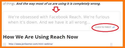
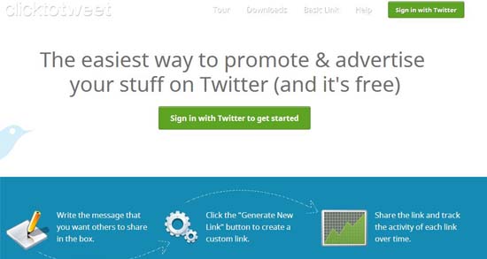
It’s a great tactic that you shouldn’t ignore. If you’ve written something super shocking or catchy, then turn it into a “click to tweet.” For this you can use a site like: clicktotweet.com that generates the link for you to put in your content, and then it tracks the clicks you receive.
Check it out:
9- Check list:
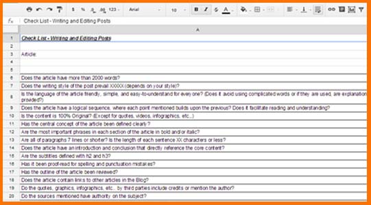
Here at Postcron, we use a check list with various aspects and criteria that we want to make sure we don’t leave out of any of our posts. It’s a memory aid, to ensure that each article is as perfect as possible, and that all posts meet the same basic requirements.
Also, if you’re working with other freelance writers, having a similar list, allows new writers to get an idea of what you expect and structure the development of their articles.
So, here we share with you our very own checklist, don’t forget to use it and adapt it to your needs – ours is just one example: make a copy of it here!
Conclusion:
Well, dear readers, we’ve reached the end of this series of articles. The road was quite long, but I hope you’ve found it as rewarding as I did. We can finally conclude after lots of information that its super important for us to understand the behavior of our readers: they first scan the content, and then decide whether or not to read it. This means we’ve got to be quick and smart to show them we have the answer or solution they’re looking for in less than 10 seconds.
Google and our readers like articles over 1500 words, thus, work on providing a good experience and add valuable information to the content you create.
We’ve also learned that there are design tricks that help us create posts that are easy and quick to read. In addition, we’ve discovered psychology secrets that allow us to create blog posts that are devourable from start to finish.
