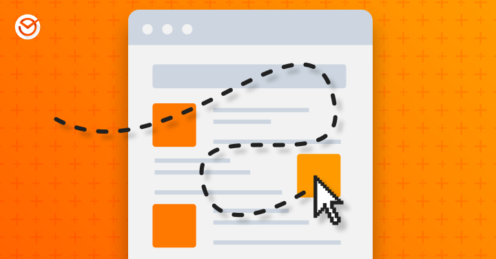
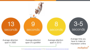
In a world where the human attention span has decreased to eight seconds, having an intuitive website can significantly improve your bottom line. An intuitive website is part of the user experience someone has when they visit your site. Think of it like a visit to a restaurant—we don’t always notice when we receive good service but we are hyperaware when we receive bad service.
The more positive a person’s web experience is, the more time they will spend on your site, and the more likely you are to make a meaningful connection.
Why does this matter? These connections can turn into conversions: that all-important moment when someone takes the action you want them to take. Whether that’s making a purchase, signing up for your newsletter, or downloading an e-book, conversions are the backbone of business growth.
Still not convinced? This Hubspot report noted that 76 percent of consumers say the most important factor in a website’s design is that the site makes it easy for them to find what they want.
Use these five tricks to make your website more intuitive and turn your online visitors into customers.
1. Prioritize Having an Intuitive Website
We know it sometimes feels like your to-do list never gets shorter. If you need convincing that your website should be near the top of your priority list, remember that global e-commerce sales are expected to double by 2021. More importantly, user experience outranks other factors when it comes to how people decide whether to finish an online purchase. Even if you aren’t an online retailer, your customers still rely on your website to make decisions about doing business with you.
What to do: Make having an intuitive website a business priority.
How it will help: By making your website a priority, you make the user experience a priority. Your customers will appreciate it and that’s good for business.
2. Speed Up Your Loading Times
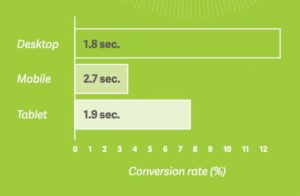
When it comes to website loading rates, speed matters. According to statistics from 2017, 51 percent of U.S. online shoppers cite slow site loading times as the top reason they abandon a purchase. And the problem exists across devices—a study by Google found that 53 percent of mobile site visits are abandoned if pages take longer than three seconds to load.
This matters even you don’t sell your goods or services online. According to this article from Forbes, a study of online retailers show that almost half all consumers use their phones to shop, but only one in five complete transactions on their mobile phones. So what are they doing online? They’re looking up product reviews while they shop in-store or comparison shopping. If they abandon their search because your site is too slow, they won’t have the information they need to make a decision.
What to do: Make sure that your pages load quickly across all devices and platforms.
How it will help: It will decrease the likelihood of people giving up before they get the information they want.
3. Meet Your Customers’ Expectations
As part of your digital strategy, you have hopefully developed a buyer persona for your target customers. This is relevant to web design because your target customers have their own expectations about how your site should work. Each time you don’t meet their expectations, you eat into those precious eight seconds and you risk losing a conversion.
Know the demographics of your target market and how they behave on the internet. Incorporate that knowledge into how your pages are organized. If your target customers expect to find a search bar in the top right corner, then give them one. If you don’t, they will probably leave your website without finding what they want, and most certainly without buying anything.
What to do: Give your target customers what they expect from a website.
How it will help: It will prevent your website visitors from getting frustrated and moving to the next website.
4. Accommodate the Way People Read
Eye-tracking studies have uncovered a lot about how we scan web pages to find information. Research by the Nielsen Norman Group in 2006 revealed the “F” pattern many people use to scan text. This means the first few lines get the most attention (with less attention paid to what follows) and text on the left gets more attention than text on the right.
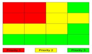
That’s not the only pattern, though. The Gutenberg Diagram depicts the “Z” pattern that people in western societies typically use to scan large blocks of text. Both examples can help you make your website more intuitive.
What to do: Put the most important information in the first two paragraphs of each page of content. Incorporate visual images, contrasting colors, subheadings—and where appropriate, bulleted lists—to make the remaining text easy and attractive to navigate. Check out this article for more tips.
How it will help: It will reduce the likelihood that your web visitors will overlook important information on your website.
5. Make Navigation Easy
The structure of your website needs to be intuitive and easy to navigate. That means that menu items need to be clearly labeled. Kissmetrics notes that visitors expect to find horizontal navigation bars at the top or vertical navigation bars on the left. While it’s tempting to be different, resist this urge—otherwise, you risk making your visitors frustrated.
What to do: Stick with conventional locations for menu bars. Limit the number of items in your main navigation bar—we suggest no more than seven. (Any more than that and the page will look crowded and people will have a harder time remembering what they are.) And don’t forget to optimize for mobile.
How it will help: It will reduce frustration (and therefore the bounce rate) and make it easy for your visitors to quickly find the information they want.
Spending time and effort to create an intuitive website is about more than just technology. Like the restaurant example, it is an investment in your whole business because it reflects your commitment to your customers. That will help foster trust with your customers, which is what will bring them back to you time and again.
If you want to read more about how user experience applies to other initiatives, check out our blog on:
- How to apply the user experience to your email marketing campaigns.
- Optimizing Landing Pages: checklist for beginners and especially for professionals
Do you have more questions about what goes into making an intuitive website? Ask them in the comments below!