Perhaps the idea of creating a PERFECT Landing Page sounds a bit ambitious right? But believe it or not, IT’S POSSIBLE!
There are so many studies that allow us to see users’ behavior while browsing a website. So with that info, we’ve put together the following series of FUNDAMENTAL steps that will help you create one.
Keep reading this article where I’ll explain each of the steps you should follow and which elements you need to implement to get your Landing Page to meet its objective.
Before telling you about the FUNDAMENTAL elements to get your Landing Page to be PERFECT, we must understand two things very well:
What’s a Landing Page? and What’s the difference between a Landing Page and Home Page?
Normally we use the term “Landing Page” to refer to the page the user sees the moment they “land” on our page once they’ve clicked on a link and/or banner. In most cases, the landing page is an extension of an ad or promotion, to detail the product or service we offer.
The “Home Page” is the main page, or front page of our site. Most of the organic, social, and direct traffic we receive will point to this page. Although some ads might point to it, as we’ll see below, each ad should be redirected to a page specifically designed to sell: A Landing Page.
What is the purpose of the Landing Page?
TO CONVERT. That’s it. That simple word.
We say that a page achieves its “conversion” when the user who got there finishes by BUYING our product, SUBSCRIBING to our service and/or DOWNLOADING something we offer. If any of these actions occur, it means we’ve done a great job.
Many companies in their desire to quickly get on the market, mistakenly invest heavily in public advertising without first doing an overview and auto-criticism of their landing page(s), which precisely, is most important part for convincing the user to “BUY” what is being offered.
For example, if we make an analogy with sports, it wouldn’t make sense if a player scours the entire field perfectly dodging defenders, gets to the goal area and in matters of seconds, due to a simple mistake, the play doesn’t end in a goal ?…
Well, in this sense, the Internet works in the same way! Once we get the user’s attention, once we’ve got them to CLICK on our ads, WE’RE ALREADY IN THE GAME! We have just SECONDS to get them to stay on our site, and convince them to make the CONVERSION.
The 6 factors that come into play when it comes to optimizing a Landing Page
We said that the goal of a landing page is get conversions, get the user to act, CONVINCE them to act, and we only have a few seconds to do so.
There are 6 factors that influence the process, and help us convince our client (later I’ll cover them in detail). Take notes because they’re really important!
1- PROPOSITION VALUE: we mean, what’s unique about the proposal;
2- URGENCY: customer’s urgency, their need to purchase;
3- RELEVANCE: The importance of our proposal for the client;
4- CLARITY: the clarity with which it is explained;
5- DISTRACTIONS: distractions that may arise during the process;
6- ANXIETY: the customer’s concerns (or anxiety) about the product or company.
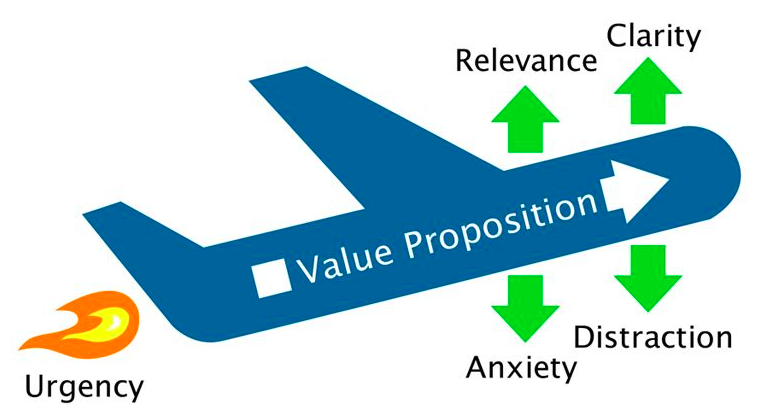
The Model “LIFT” (Landing Page Influence Function for Tests ™) designed by Chris Goward
To make a perfect Landing Page, we need to work methodically to improve each of these factors.
The value proposition must be unique and relevant to the customer and should be explained as clearly as possible.
TIP TIP TIP. “The 5 second rule”: The potential customer must be able to understand what we’re selling in less than 5 seconds. That’s why the clarity and relevance of the message play a fundamental role. If we don’t present what the customer is looking for -immediately-, they could leave and never come back.
However, a unique, clear and relevant proposal isn’t enough. To be able to sell, there must be a real need, an URGENCY, and it’s our job to generate it. Without this, a potential customer could, for example, “put the purchase (or subscription) off until next week” or whatever conversion for that matter; and the worst case scenario: never return to our site.
What we mean is, our proposal works exactly the same as those so-called “impulse purchases”, that use the terms “free“, “promotional price“, “test now and get …” which are crucial. If you review your own buying behavior, surely you’ll notice that more than once, at the cash register ready to pay for your purchases at the supermarket for example, you suddenly wanted to buy a product you saw for “2×1” or some unique offer “today only, buy at sale price”, “with your purchase of … plus ..$ get … for free ..” and Yes! Surely, more than once you’ve ended up buying it. Later, we reaffirm our actions with the excuse that “it was free”, “a great deal”, etc. This shows how the purposes of these proposals are perfectly fulfilled. They CREATE AN URGENCY.
Still, a single, clear, and relevant proposal doesn’t guarantee that a client will buy urgently. E.g. If we were in the street and someone approached us with the latest Iphone and they offered it to us for $50, would we buy it? … We probably wouldn’t trust them, and would think that it was stolen and not end up buying it. The same is true in the online world. Our Landing Page has to reflect that we are a credible company and eliminate any anxiety the client might have regarding the veracity of our company and/or product.
Finally, even with a perfect, clear, relevant proposal, a credible company and a sense of urgency, if we aren’t careful, the client could get distracted during the process. Therefore, we must remove any source of distraction on our Landing Page. We should order and align elements, in order to tell a story that has one single objective: THE CONVERSION.
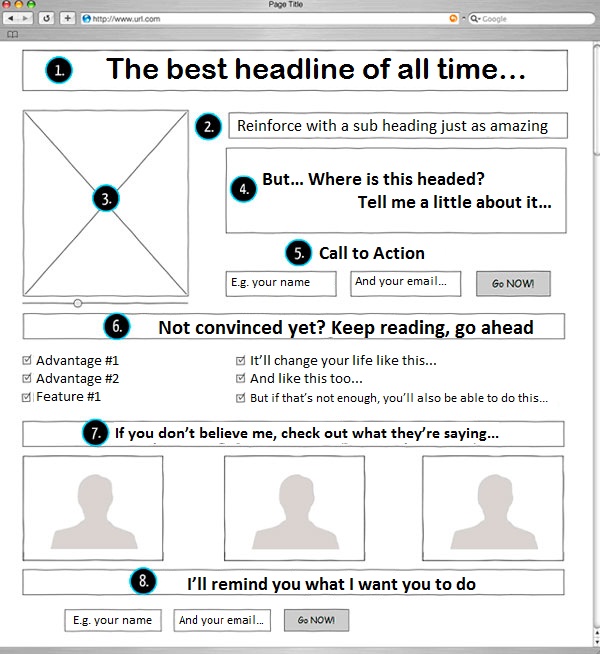
Checklist: 10 essential items your Landing Page has to have in order to be successful:
Now that we know the fundamental factors, let’s take a look at the essential elements of content your Landing Page should have. (Just as in the fashion world there are so-called “must haves” for different seasons, in the digital world also have them :))
1) A unique, clear, and relevant proposal for the potential client (“Unique Value Proposition or UVP”).
2) A picture or “star” video of the product. (“Hero Shot”).
3) The benefits for the potential customer. (“Benefits”).
4) Testimonials from happy customers. (“Social Proof”)
5) People, brands, or recognized media (authorities) or brands that support the company. (“Authority”)
6) A call to action button that’s clear, large, legible, attractive, and that stands out. (“Call To Action”)
7) Prices and refund policy if any. Some say it’s not necessary, but not putting them generates mistrust!
8) Privacy Policy and Terms of Service.
9) Information about the company and multiple forms of contact.
10) Finally, but very importantly, the page should load fast!
So, why did we list them in that order of hierarchy? If you read carefully, you’ll notice that it’s almost like closing a sale. Indeed it is, and like all sales, the process must be respected. We must respect the process and the order so that the goal can be achieved, in this case what we call the “CONVERSION“.
Below I’ll explain what each one of these steps consists of, what design criteria and tone of communication should be applied to ensure SUCCESS.
1) A unique, clear and relevant proposal for the potential customer
As its name suggests, we’re talking about your sales pitch; it’s important that you communicate it in parts in order to achieve and strengthen sales, thus an appropriate scheme would be:
-
a) The Title:
The headline is the key here. Since our goal is to capture the attention of visitors to get them to keep reading and stay on the site.
It should be: Specific, Concise, Focus on what your customer wants to acquire. It’s important that the content is completely related to what has been clicked on to reach the Landing Page.
The headline, in terms of design, should be large and eye-catching enough to grab all of the user’s attention.
When it comes time to writing it, always keep in mind these 4 points:
1. It should convey USEFULNESS or some type benefit.2. It should convey URGENCY.3. It should convey something UNIQUE.4. It should be ULTRA-SPECIFIC.Seems like a challenge right? It is. Something as simple as a headline is crucial for a Landing Page. If you’re unsure check out this interesting link with some tips to help you write your headline.
-
b) Supporting Headline:
If you want to keep the main headline concise, the best way to do that is to incorporate a second supporting headline, which can be used in two ways: either to provide more information or to complete a sentence.
-
c) Reinforcement Phrase:
If we think back to a previous post on how to write the perfect blog post, keep in mind that users scan the site before diving into the content. That’s why sub headings and/or highlighted phrases are key. This is where “phrase reinforcement” comes into play.Usually this phrase is located at the midpoint of the site, isolated and/or standing out from content. Note that it’s just as important as the headline, therefore we must use it wisely and pay attention to the message we’re conveying with it.
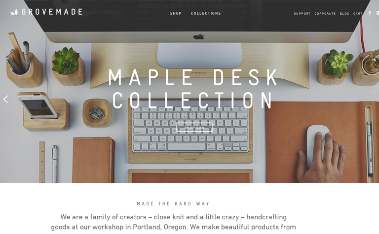
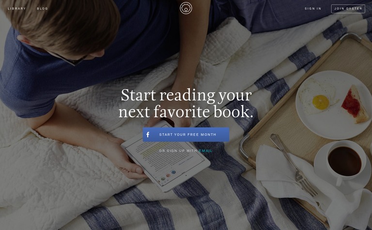
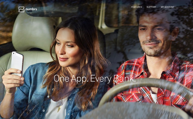
Here you can see some examples of how these companies use headlines, supporting headlines, and reinforcement phrases:
-
d) A Closing Argument:
The closure as its name implies, is the final sentence, the last chance we have to try and convert.Your message is critical in terms of design, it must be eye-catching, and be located near the “Call to Action” (we’ll see more on the CTA below).
For example:
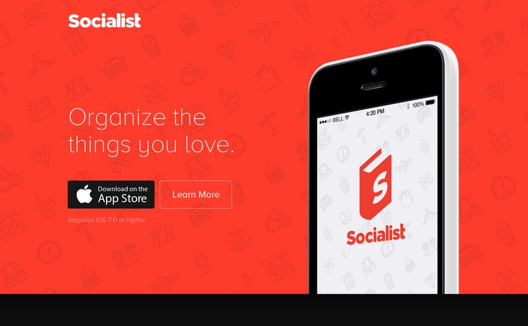
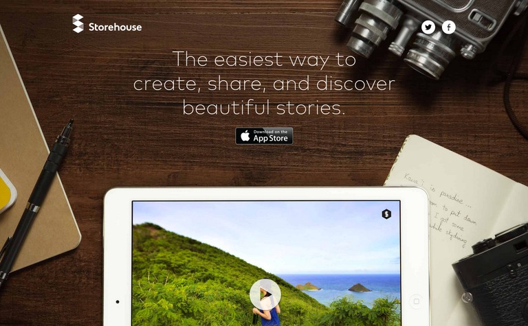
2) A picture or video of the product. The “Hero Shot”
You’ve probably heard the phrase “a picture is worth 1000 words”. In terms of advertising and marketing, this is 100% true.
Users always “buy” what they see, the tangible. It’s due to human nature. An image allows us to achieve “empathy” with the user, showing them how the scenario would be using our product and/or service.
Thus, this resource is one of the main factors for getting users to convert or not once on our Landing Page.
This resource can be used in two ways:
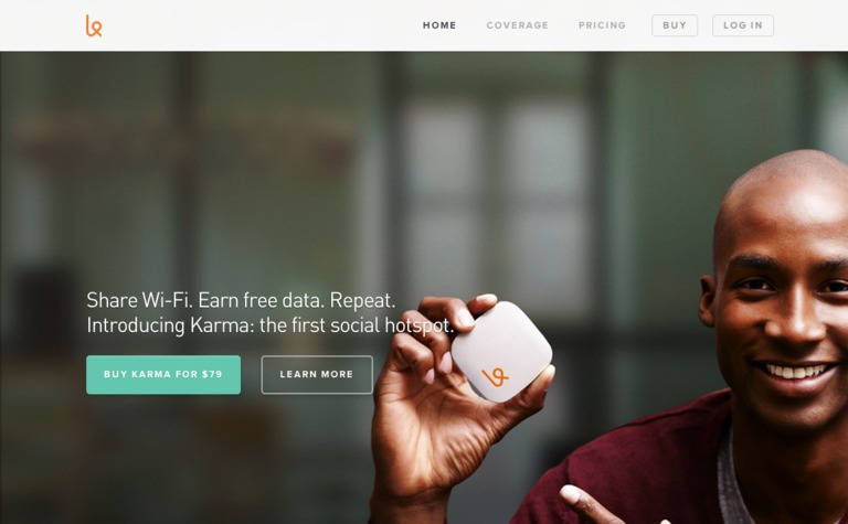
- PHOTOS: This is pure advertising! Yes folks! This is key for showing situations where the user is happy with our product and/or service. Show what the customer wants to buy, and the solution to their problem.
For example:
- VIDEO: Videos make a more complete and surprising contribution. In the eyes of the viewer, a video is always more truth revealing than a picture (because we all know that there are numerous programs for altering images). On the other hand, a video is great because it allows us to tell a story, make a brief summary, and show the solution that our product and/or service provides.
Examples of the using videos: – https://www.facebook.com/paper– http://metalab.co/
3) Benefits
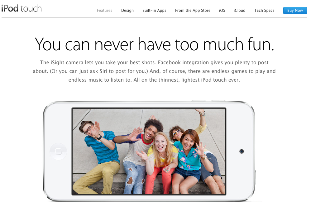
It’s essential to clearly detail the benefits of your product to the customer. It’s really important to distinguish the benefits of the products with its features/specifications. I’ll explain a little more, with an example:
When you enter the Ipod Touch page (portable music player by Apple), we can see that the first line says “You can never have too much fun”. They could have put how many gigabytes of storage the device has, the screen size, weight, etc. But no, they chose to mention the benefits first: “You’ll have fun, you’ll get the best pictures, you’ll be able to listen to music and you’ll be able to have fun with the games”. Experts say, we buy with their hearts and justify with reason. This is why we should ALWAYS put benefits first, and then reinforce them with the technical specifications of the product to provide the customer with even greater reliability and security.
“We buy with the hearts and justify with reason.”
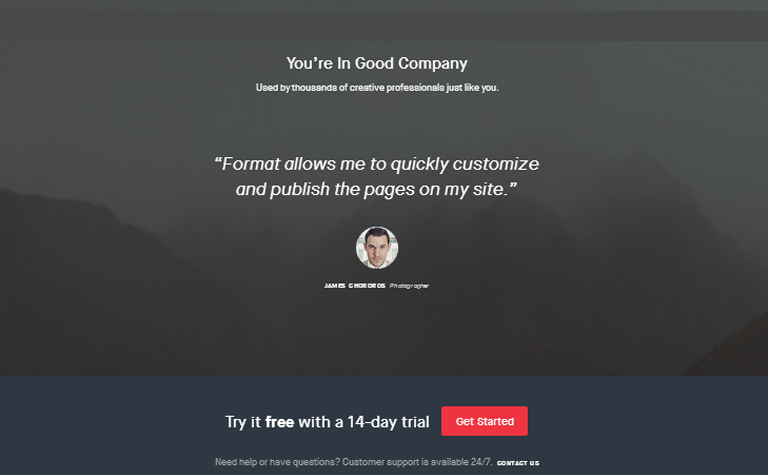
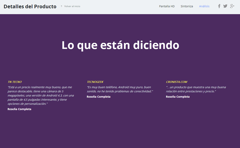
4) Testimonials from happy customers – “Social proof”:
What others are saying …. YES THAT MATTERS!
In terms of advertising and marketing, a user’s perception of our product and/or service is fundamental.
Think about it, when you feel unsure about any purchase you’re considering, Don’t you ask for the opinions of others? Or Google what experiences other users have had with it? Right?! That’s why it’s essential to incorporate testimonials and/or statistics that further strengthen our selling proposition on our Landing Page.
For example:
TIP TIP TIP: As it’s fundamental to provide all possible information to the user, here’s a design tip: It’s very useful to summarize statistical information with graphic symbols, and use colors and large numbers. If we remember that users scan, it’ll be easier to get them to remember such items rather than reading them in a text.
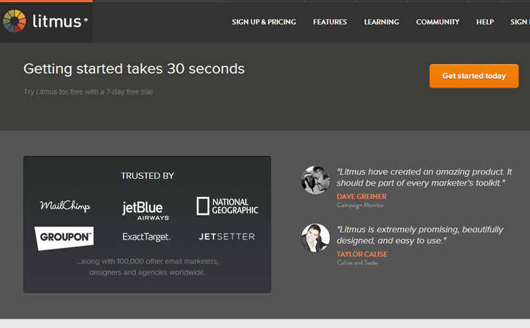
5) Get well-known companies or people (authorities) to endorse the product or service.
You’ve probably seen on more than one occasion advertisements represented by athletes, famous and/or famous personalities. In most cases you think “how this company must invest in advertising” … maybe you have the misconception that this resource doesn’t work … Well you’re wrong! IT WORKS and a LOT!
It’s our nature to tend to admire and imitate people with whom you feel identified with, either by our activities, beliefs, values, etc.
We are always looking for models “to immitate.” That’s why advertising constantly is making use of this resource, because it’s been studied and shown to be effective, and investing in it is “well worth it”. This is what we call Authority. We call it that because this “figure” who we respect and admire, simply by demonstrating how satisfied they are with our product and/or service, “endorses” us, so to say, and we’ll certainly gain more potential to convince customers who rely on our chosen persona.
A great case to cite is “Malik” hockey sticks, for example. After using the image of the best hockey player Luciana Aymar in their ads, sales exploded!

Just like this case, there are so many more, as you probably already know and have seen. Please bear in mind: use a person your customers trust and that has authority for them and it will be a great resource for you to further convince them and get them to CONVERT once landing on your site.
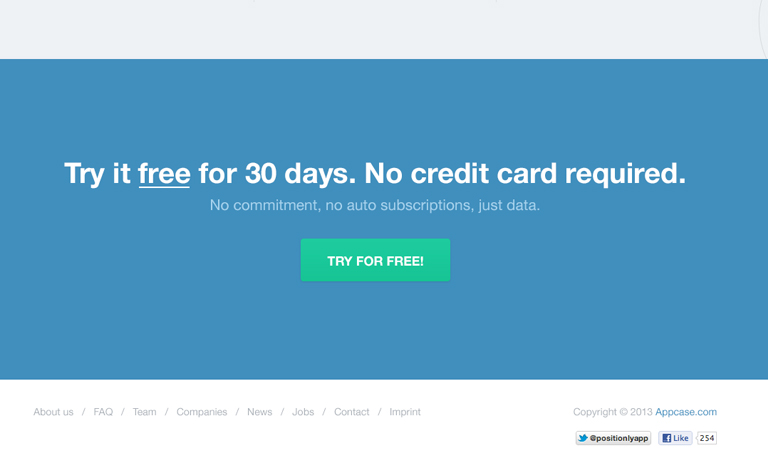
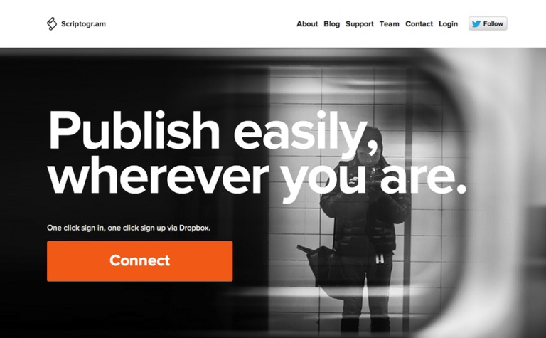
6) A clear, large, legible, attractive call to action button (“Call To Action”), that stands out.
Call to Actions are those “giant buttons” you usually see while browsing. As its name suggests, the call to action, is the final element we use for closing the sale, download, purchase, subscription, etc. It’s the very action that makes CONVERSION happen on our Landing Page.
Now … How to make a CTA that CONVERTS:
- DESIGN IS EVERYTHING! Here, it’s essential that this element stands out from the rest of the content. It should be sufficiently attractive and eye-catching so that the user wants to click on it.
- WHAT WILL HAPPEN WHEN I CLICK ON IT? It’s essential that you start with the subject and the verb, the user needs to know WHO and WHAT ACTION will happen when they click on the button.
- HOW LONG DOES MY BENEFIT LAST? Include numbers, be specific, especially if you’re providing a free trial, or promotion with a fixed-term. For example: “Try our service free for 1 MONTH.”
- BE CAREFUL WHERE YOU PLACE IT! The location of these elements is key when it comes to converting, as with any sale, closing comes at the end. That’s why it’s ideal to locate it both at the top (as there’s always anxious users) as well as at the bottom of the Landing Page. That way you ensure that the user was able to evaluate your proposal entirely.
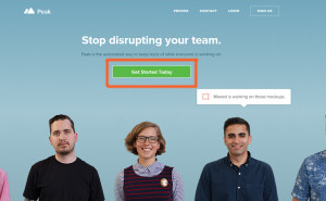
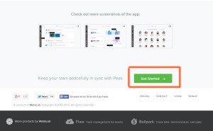
TIP TIP TIP: The most important elements (those that we’ve mentioned so far) must be introduced “Above The Fold”. This is a term that refers to everything that can be seen on the page without having to scroll down the page.
7) Very clear Prices and Refund Policies if any.
There’s enough on Price Issues to write a book (we’re planning on writing another post about this soon), but the main thing to understand is that showing prices on the landing page is part of the good deal. It provides transparency and eliminates anxieties. Those interested in the product or service will want to know exactly how much they’re going to have to pay. And the lack of straightforward pricing could generate mistrust and scare away our client.
If possible, offer something for FREE! Remember, as I mentioned earlier:
all of the words that you can use to generate URGENCY will be ideal in this case in order to accelerate the purchase. And the word is FREE, as numerous studies have shown, it’s a great accelerator.
More on this in our future post on Pricing.
8) Privacy Policy. Terms and conditions of service.
Any information you can provide about the company, how they keep customer data safe and the terms and conditions of the contract (guarantees in case of a product), will remove any doubts and/or ANXIETY that our potential customer might have.
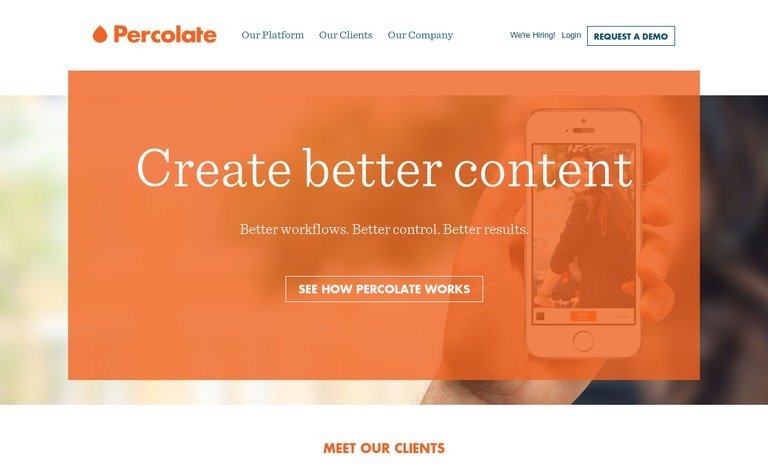
9) Information about the company and multiple forms of contact.
As I mentioned in the 6 factors that influence the process, it’s essential that you provide the user with information about who you are, the trajectory of your company, how you can be contacted, etc. It’ll serve to eliminate any suspicion.
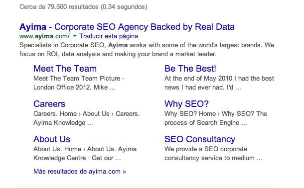
TIP TIP TIP. Provide as much information about the company and the product to the customer as possible, by using the classic pages like “Terms and Conditions” “About Us,” “Contact” and “Privacy Policy”. This not only increases customer confidence in the company, but also promotes your SEO.
Google gives utmost importance to the usability of our site. Providing all information the customer needs is highly recognized by Google as good practice for usability. In the picture above we can see how Ayima agency provides all relevant information (About Us, Meet the Team, Why SEO?, etc.) And Google shows them in the search results 🙂
10) Last but not least, the page has to load quickly!
It doesn’t make sense to have a perfect landing page … if it loads too slowly!
It’s been proven that a page that loads quickly gets more sales.
It’s important to keep in mind when you use videos and images that you ALWAYS optimize them for the web, that way your landing page will load quickly.
I recommend the following tool to analyze the speed of your page and get technical recommendations to make it faster (it’s a bit advanced, better to tell your programmer to use it to make everything faster).
https://developers.google.com/speed/pagespeed/insights/
DON’T FORGET THE IMPORTANCE OF DOING TESTS!
It’s like this, trial and error. In addition to the factors and elements that I’ve been mentioning throughout this post, as well as the techniques and factors of persuasion that we’ve presented in previous posts, in order to get your Landing Page to be PERFECT you ALWAYS have to create different versions and test out the results.
You also have to find out how the user uses your site, if they find it friendly, intuitive, obvious, etc.
An indispensable tool to use are the A/B Tests. As its name implies, this is usually done like this: you make two versions of your Landing Page, testing one certain element of your site. Then the traffic is divided into two, and you have the possibility to compare how effective each version is and how to implement the changes necessary to reach the perfection of your site. The company Optimizely for example, offers you this online tool, that way you don’t need to manage your server yourself.
We can see a clear example with the case of Mouseflow, who has developed software that’s capable of capturing user behavior while they’re viewing your site. It’s a super cool and useful tool, because it’s not the same to see stats about where they click, etc. than to watch them live and direct! That’s why I definitely recommend starting to implement this application.
Well dear reader! We’ve reached the end of this article.
Summing up – You should always keep this in mind:
Offer a unique, clear, and relevant proposal. Get rid of all doubts and anxieties about your company and/or product. Provide all the information possible and support your site with the testimonies from satisfied customers and authorities that evaluate you. Create a sense of urgency and get rid of all distractions. The one and only objective is to get the user “TO CONVERT”.
So that you can easily remember the 10 ESSENTIAL ITEMS YOUR LANDING PAGE HAS TO HAVE IN ORDER TO BE SUCCESSFUL, here’s a info-graphic that’ll help you!