As you know, working on social media channels is extremely important nowadays. Surely, at this point , you give more importance to your Facebook, Twitter, or Google Plus than you do your web page. Or perhaps, you haven’t even created one yet, for fear that it might become useless. Am I right?

So, ready to start reading? Here we go!

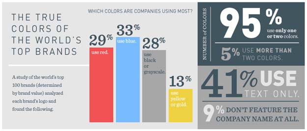
A- The science of color: a quick review of some info that maybe you had no idea about
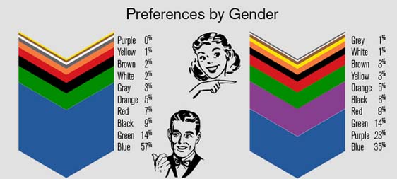
1.A- The most influential factor on the senses in the purchasing-making decision :

- Men: Blue, Green and Black.
- Women: Blue, Purple and Green.
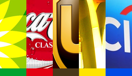
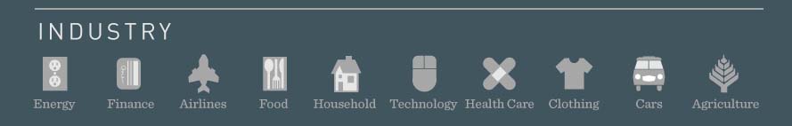
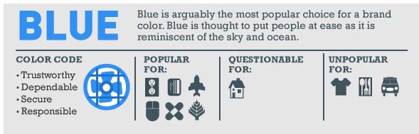
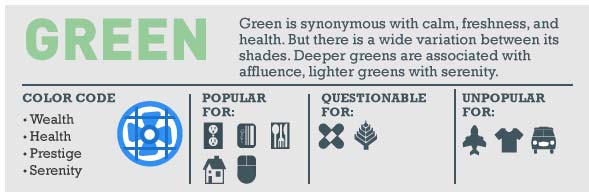
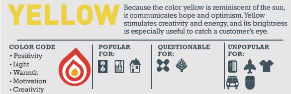
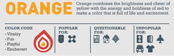
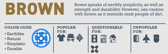
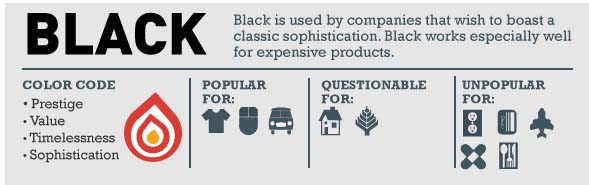
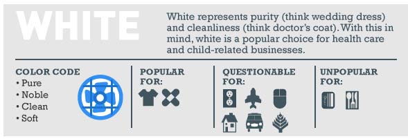
Each icon represents an industry:
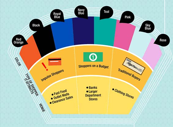
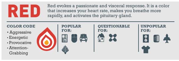
Red is aggressive, energetic, provocative, and attention-grabbing.
It’s popular among related industries: food, technology, cars, and agriculture.
It’s popular among related industries: technology, health care, and finance.
It’s popular among related industries: technology, health care, finance, energy, agriculture, and airlines.
It’s popular among related industries: food, technology, finance, energy, and household.
It’s popular among related industries: food, energy, and household.
It’s popular among related industries: technology and health care.
It’s popular among related industries: clothing, cars, and agriculture.
It’s popular among related industries: technology, cars, and clothing.
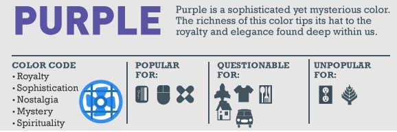
It’s popular among related industries: clothing and health care.
B- Mistakes with colors you should stop making on your landing page
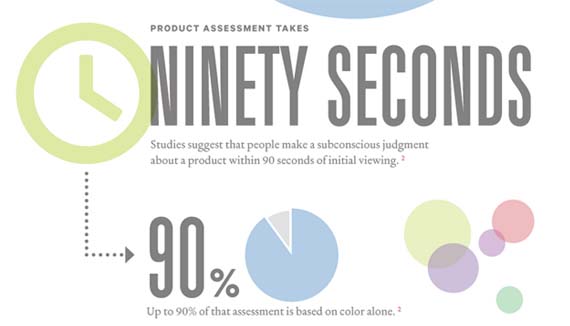
As we mentioned in the beginning, the science of color is extremely powerful. The color factor matters the most in the process of conversion on a landing page, in addition to other design elements such as: Size, Shape, Location, and Movement.
Let’s utilize this excellent analysis by Marketing Experiments to develop the following 5 fatal errors relating to the use of colors. That way, you can start analyzing your site and optimizing right away:
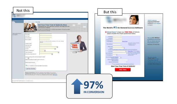
7.B- Error 1: Emphasis
The error may lie in the lack of emphasis or by placing emphasis on the wrong item or place.
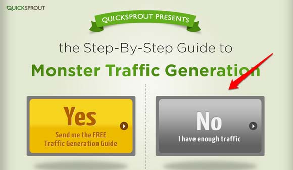
Marketing Experiments analyzes a case where the site needed to get more subscribers.
Original: On this page nothing was being emphasized or attracting attention. There was no element guiding the user to make a concrete decision. When a person is faced with lots of choices that all seem “the same”, they become confused. They would rather abandon the dilemma, rather than to stop for a minute and try to figure out what exactly is being offered and what the best option is. On the other hand, when the process is simplified, highlighting and indicating one option over another, doubt disappears quickly and it’s easier to get a YES from the customer.
Optimization: A game of shadows and color gradients was used to guide the eye to the main point. Here, it’s highlighted by a different color in order to strengthen the proposed value. Also, the information that was being given through the text is simplified. That, along with the use of colors, now guides the user towards exactly what the company wants them to choose. With these changes, an 81% increase the CTR was recorded.
The error in this case is that the colors generate a distraction and leave the Call To Action button (CTA) out of the form and put it right in the middle of the visual journey the user is taking through the page. In the optimized version, the color of the CTA button is more intense and its placed at the foot of the page. This “forces” the user to look through the entire form and finally arrive at the CTA button, basically, guiding them to the desired action. Result: 97 % increase in CTR
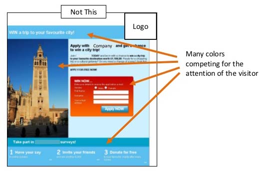
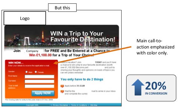
8.B- Error 2: Number
In this case, the saturation of colors, or “lack of” greatly affects the decision process. Since it can be a confusion factor, or on the contrary, something that helps assimilate the information better.
Consider this example analyzed by Marketing Experiments:
Original: Too many colors are competing for the person’s attention at the same time.
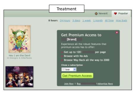
9.B- Error 3: Combination
At this point, I think it comes in handy to bring in an explanation by Derek Halpern in one of his video posts, which is super logical, but apparently difficult to get used to. He states that there are two colors you should use on your web page: Passive colors and Action colors:
- Passive Colors: those used to generate the visual appeal of the site and give your brand personality.
- Action Colors: show people that “X” color = click. This color should be used to educate visitors and regular users, to know that certain buttons, links, and boxes, should be “clicked on“. If we use the same colors to highlight headlines, links, or for other messages that lead nowhere, we’re wasting the resources that color gives us. Which, in this case, is showing the person who looks through the page what we want them to do.
Marketing Experiments highlights this case, a huge combination error in a dialog box which contains a CTA for premium access to content this site offers.

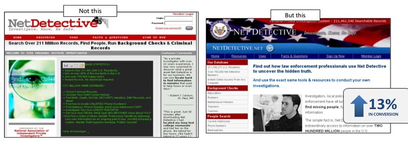
10.B- Error 4: Message
Each color conveys a message. That’s why it’s essential to know the meaning of each, which emotions they activate, and what associations they can trigger. In the following case, the original version doesn’t transmit credibility nor seriousness nor reliability, which are the necessary values for this type of product.
11.B- Error 5: Flow
The case we saw before about the error of “emphasis” could also fit under this category. It’s necessary to use colors to accompany and guide the people who visit your page. That way, each user can correctly interpret the messages transmitted by the different design elements.
The following is another example of how the misuse of color can actually interrupt the visual journey and the natural train of thought each person experiences while reviewing contents of a site or landing page. With good use of color and layout, you can get the user to perform the actions you desire, effortlessly.
Original: Although color is being used for the CTA button and could potentially attract lots of attention, it’s been placed in a white box outside the main message. This interrupts the person’s natural train of thought, leaving a space that generates nothing but noise. It disengages the user, and in that precise instant, they begin to doubt —- exactly what we want to avoid.
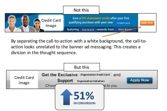
Optimized: the button is now part of the message. It doesn’t interrupt the visual journey, and it simplifies decision making, without creating a bunch of unwanted noise in the middle of the page. You can see that the blue button is the only element that attracts attention. This scenario opts for a design strategy that uses low contrast, less color, but lots of emphasis on one single well-placed element.
C- Tips for optimizing your Call To Action button
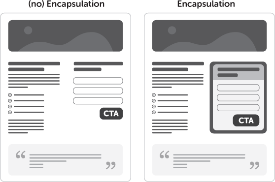
12.C- Encapsulation
Don’t let the message or the point of interest get lost among the other elements on your landing page. Encapsulate the button in order to incorporate it in the message and correctly draw attention to it.
13.C- Directional Cues
Don’t give the user a chance to wander around the page visually. Guide and indicate them directly to the places you want them to pay attention to on your landing page. If necessary, use elements that help direct the eye over the page.

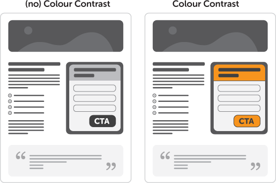
14.C- Color Contrast
As we’ve mentioned in some of the other topics above, remember that contrast doesn’t mean using lots of colors. It means applying the weight of the color in the right place.
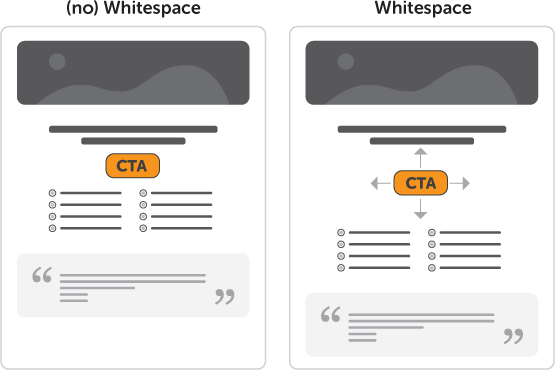
15.C- Whitespace
You can highlight buttons or boxes with CTAs by using whitespaces, and avoid generating noise with too many colors or extra elements that might steal away the attention.
16.C- In addition to color, optimize your site and buttons with a smart and distinct CTA.
Mohita Nagpal puts together an excellent collection of ideas for optimizing buttons and text on your landing page, in the blog Visual Optimizer. Let’s review them quickly:
- Use phrases that are difficult to say NO to, or that are so uncomfortable or ridiculous that it makes the person reconsider their decision. Surprise visitors on your site, remember that they’re constantly exposed to CTAs, and you’ve got to break the barrier of skepticism that we’ve all generated by constantly bombarding them with information…


- You can also optimize messages like, system errors, the “404 – Page Not Found”, or pop-ups, in order to not lose any potential clients. You can’t just say “Page Not Found” anymore. Think about the people who visit your site, what language they use, and what would be smart to say to get their attention, and keep them on your site.
D- Two tools you’re gonna love that’ll help you make better decisions about colors!
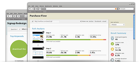
17.D- Navflow:
This app analyzes the path visitors take through your site, and lets you know where they find it difficult to follow the flow of actions.
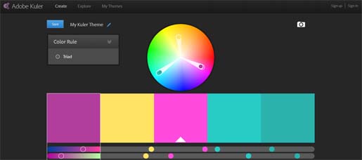
18.D- Kuler de Adobe:
This app allows you to analyze and test the colors on your site using different criteria, and helps you determine which ones are the best combination.
Let’s conclude:
Understanding the power of color and its the science behind it, is really important for optimizing your page. Colors not only serve for grabbing your user’s attention, but even more because they communicate messages using the framework of associations that each one triggers. As we said in the beginning, you must also learn to market within your web page, and take advantage of each design element in order to connect with the people who visit your site, guide them, and get them to perform the action you desire.
Now, if you liked this article …

Main Sources :
http://unbounce.com/conversion-rate-optimization/design-principles-increase-conversions/
http://visualwebsiteoptimizer.com/split-testing-blog/copywriting-examples-for-high-conversions/
http://socialtriggers.com/
http://www.marketingexperiments.com/site-optimization/website-colors-and-conversion.html
http://blog.kissmetrics.com/psychology-of-color-and-conversions/
http://thelogocompany.net/blog/infographics/psychology-color-logo-design/
http://brandongaille.com/how-colors-influence-consumer-buying-decisions/
http://blog.kissmetrics.com/how-colors-affect-conversions/?wide=1
http://www.pinterest.com/pin/100838479128968459/
http://blog.kissmetrics.com/color-psychology/