That instance when a customer or potential (lead) client opens an email for your brand or business, can be compared to when a man proposes marriage to a woman and waits for his answer: the YES OR NO is crucial.
If your brand´s proposal in an email doesn´t move, inspire or prompt an immediate answer, the answer will be NO and the client will close your email perhaps forever (maybe a little exaggeration helps to raise awareness).
On the contrary, if your email piece is capable of providing a good user experience (UX); if you take into account that your subscribers appreciate or respect your brand or products and you are able to reach their emotions, the answer will be a strong YES.
We aim to show you in this post what the main principles of the User´s Experience (UX) are so you can put into practice in order to create effective and original email marketing pieces. In addition, we have put together 5 strategies that can serve as examples when you begin designing email marketing campaigns.
The importance of email marketing
Have you already created email marketing campaigns? Let´s suppose that you haven´t. We warn you that you are missing out on one of the best channels of communication with your customers or potential clients. And something else (and not least): you are missing out on increasing your conversion rates!
“Email conversion rates are three times higher than social media, with 17% more conversion” (Source: McKinsey & Company)
To begin designing email marketing campaigns, take a look at this article: “Introduction Guide to Email Marketing: what you must know, no matter what, before you begin your campaigns”
If you have already created email marketing campaigns, you know very well that this is no easy task. We are not referring to its technical execution, but the creation of attractive pieces that achieve a greater number of conversions.
The principles of user experience (UX) can be applied to email marketing campaigns aimed at increasing the level of empathy with customers and consequently improve the level of ROI (return of investment).
But first of all,
What is the user experience or UX discipline?
It has to do with all those elements or factors that are at stake when a user interacts with a particular environment or device. An example of this interaction is that the user must have a positive or negative perception of the product, service, device or brand.
Example: a person passes by beautifully arranged display window and stops to look at a garment. The individual decides to go inside the shop, feels comfortable, likes the store and the garments, but … the salesperson is in a bad mood and treats the person poorly. What happened? The user´s experience is broken at this point as well as the attention.
Of course it could have broken down at any point during the user´s experience (the store was not displayed correctly, was too small or too big, had few garments or did not accept credit cards, etc.).
We choose this example because we want to make it clear that the user experience is not only about tangible aspects, but also has to do with emotions, feelings, reliability of the product, the brand´s construction and transmission, etc. Meaning, it has to do with non-tangible issues that are not seen.
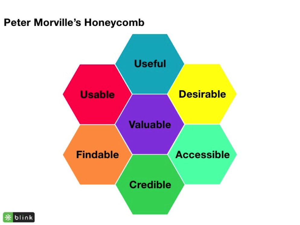
The idea of this post is not to delve on the user experience as a discipline. What we want is to apply the general concept to an email marketing campaign. How can you do this? Through its principles (those defined by Peter Morville in the “honeycomb”).
The principles of the User Experience (UX)
The principles of the User Experience (UX) are:
- valuable
- useful
- usable
- desirable
- accessible
- credible and
- findable.
How do you make all these elements appear in an email marketing campaign? Follow the post to find your answer.
IN ORDER TO INTEGRATE THE PRINCIPLES OF THE UX TO EMAIL MARKETING, YOU HAVE TO CHANGE THE MENTALITY
This title is not our invention. Meaning, we didn’t come up with: “change the mentality”. Specialists say this. To integrate the UX principles in email marketing campaigns means to think of an objective above anything else.
What are the common goals of a business or brand when designing an email marketing campaign? Increase conversions, generate traffic, earn trust, gain customer loyalty, etc.
In order to integrate the UX principles to email marketing you must think first of a new purpose: help people. Meaning, create emails that are useful and valuable. You have to make sure that your clients happily read what you have sent them and they don’t regret clicking there. With this, the user experience in this aspect (the email) will be positive.
With this said, let’s take a look at five strategies related to the discipline of the User Experience that you can apply to the design of your email marketing campaigns.
5 UX (USER EXPERIENCE) THAT ARE GOING TO REVOLUTIONIZE YOUR EMAIL MARKETING CAMPAIGNS FOREVER
1.- Make an excellent first impression. Show the value of your email in the subject line!
The subject line of your email is the first element the user experiences with your campaign. This is the moment when your client decides if opening the email is worth it.
Therefore, the value of your email must be synthesized in those few words: focus on the most common problem possible. Avoid talking about specific problems. If you have a promotion, show exactly what your clients get when they click on the email.
“The subject line must be clear and show your email as valuable and useful”.
Some Examples:
Digital Marketer: “[URGENT] You’ve got ONE DAY to watch this…”
Digital Marketer: “Is this the hottest career in marketing?”
Ramit Sethi: “How to email a busy person (including a word-for-word script)”
The first example expresses “urgency” (a time limit). In the second case, curiosity is used. This technique can be achieved through questions, making a promise, or simply saying something that sounds strange or unusual. In the third case, we can say that it is a more informative matter. These are the “How” issues.
If you can´t get the attention of your recipients in the subject line, the rest of the efforts disappear in mid air, to put it poetically.
TIPS:
- The subject line must be short and to the point. Remember that users scan their inbox quickly so use short and to the point emails.
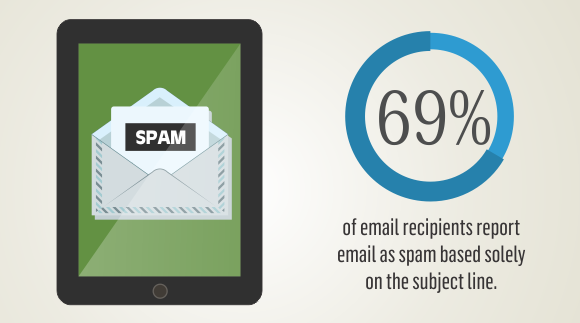
- Don´t use upper caps in the subject line. These types of emails end up as SPAM. Only apply upper caps to highlight some words like in the previous example: FREE.
- Ask a question. That way you establish a conversation with your customer or potential client. The question must be one that recipients ask often and that sums up a common problem.
- Don´t abuse promotional terms such as “buy”, “order”, “best prices”, “offer”, etc. These are spam words and must be avoided as much as possible.
-
If your audience is young, we recommend that you use emojis. By using them your message is transmitted faster.
2.- Be credible and personalize your message by using your segmentation.
It’s about designing campaigns aimed at a specific group of people capable of identifying with the content of your email. According to statistics, those emails sent to 50-100 people have higher opening and commitment rates.
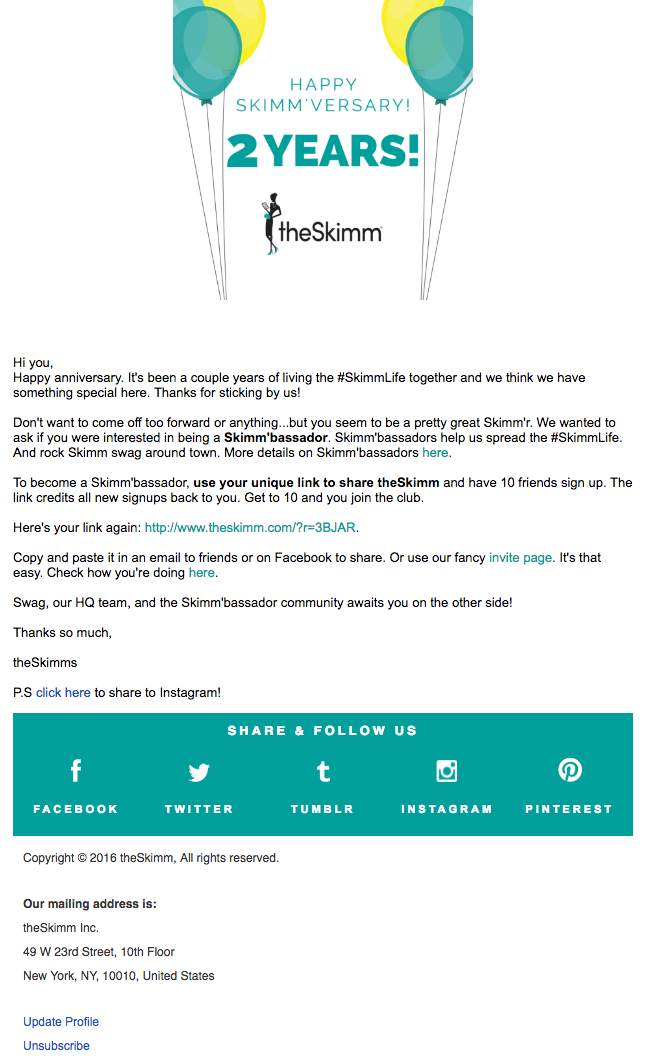
If your target audience identifies with the content, the user’s experience will be successful. Take a look at this example:
This is an email addressed especially to subscribers. It has two objectives: to entertain them for having fulfilled some time as subscribers and to become ambassadors of the brand (to retain them), which would force him to share the link with ten friends.
Undoubtedly, segmented email marketing campaigns allow you to do two things simultaneously: build a personal relationship with your readers and reinforce your credibility showing that you know your customers.
3.- Show consistency across all platforms in order to be easily accessible and avoid confusions.
This boils down to the following: your emails shouldn’t be different than your web page, your landings or the aesthetics of your social media, etc. Your emails are part of a multichannel vision of your brand. The user experience is a global proposal and emails are not the exception. Your recipients must know your brand easily so they don’t get confused and get lost along the way. They must be able to find it easily.
You must pay close attention to the charts you use on your social networks so you can replicate them in your email marketing campaigns. To find out more about how to incorporate social networks with email marketing campaigns, take a look at this article: “Social networks and Email Marketing united will never be defeated”.
4.- Images and text must complement each other in order to show that it´s useful.
Images need to have good quality and also be consistent with the text. Meaning, they must reveal the meaning of the message and the objective of the email in order to improve the user’s experience as he/she advances through the body of the email text.
A suggestion: to create graphic pieces fast and easy, you can use Postcron’s ArtStudio, a free online tool with all the sizes and formats for all your Social Media profiles.
Try to incorporate images to your text. Don´t use text alone. Content with relevant images receive 94% more visits. The reason is simple: they are more attractive and facilitate the understanding of the message.
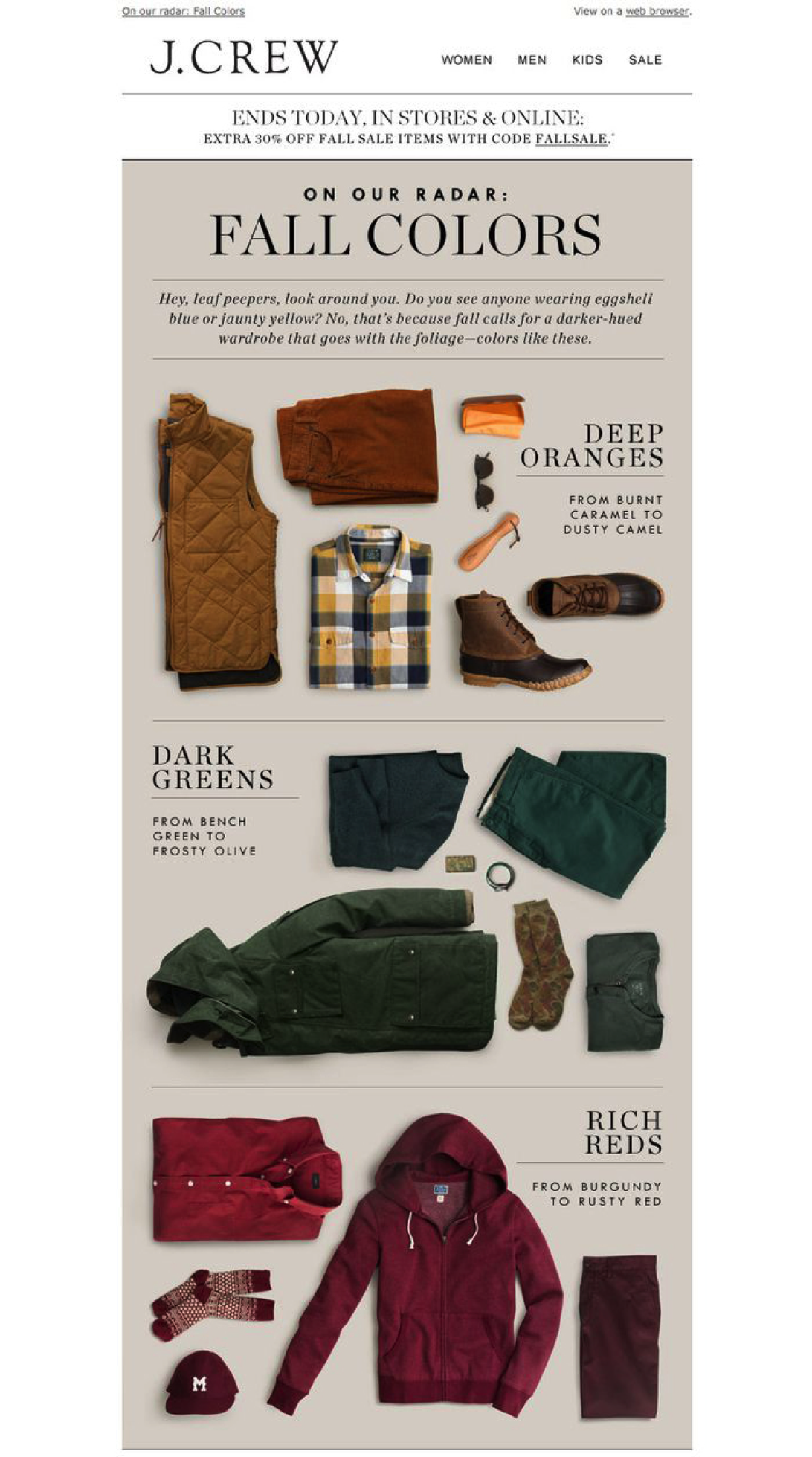
Let’s take a look at an example of a clothing store:
The subject line states: “Autumn colors”. Then, through the images, three colors are shown that are the trend for this fall: dark greens, deep oranges and rich reds.
This email simplifies the life of those interested in fashion: they now know the colors of the season and can begin imagining what garments are going to be in their closet.
5.- The emotional spark: the key component to be desirable
The entire discipline of the User Experience (UX) has a main goal: the emotional design. The content of your email marketing campaign must go in the same direction.
A good segmentation can give you accurate information about what frustrates, worries and what type of content makes your subscribers uncomfortable.
Let’s take a look at an example:
Collaborative Fund is a leading source of capital for entrepreneurs. This image corresponds to an email marketing campaign related to the company blog. The emotional is placed in the design, the colors and, above all, the text: “When you are stuck in that box, you will always answer to the perimeters”.
Up until now we have seen the 5 strategies related to Users Experience that can improve the effectiveness of your email marketing campaigns. But we have more: a bonus track that can help greatly even if it´s quite obvious and it has to do with USABILITY.
Don’t forget to adapt your email design to a mobile device!
Statistics show that:
- 48% of emails are opened from a mobile device (Source: Litmus)
- 80% of the users eliminate emails that are not adapted to their mobile device (Source: Kissmetrics)
- 56% of emails are designed for mobile devices and this number increased 155% since 2013 (Source: Litmus).
There are many tools out there that can help you generate mobile friendly marketing emails. We have come to the end of this post! We hope this has helped you and has generated interest in knowing more about this topic.
Conclusion: it gets harder and harder to get users involved in the digital world. But that is why it’s important to embrace the principles of the user experience in order to increase the effectiveness of email marketing campaigns (and the rest of the digital marketing strategies).
